Light and Shadow — Making Things Look Solid With Few Colors
When a piece of pixel art looks flat, the cause is almost never the linework or the shapes — it's the shading. You added plenty of shadow and it still doesn't read as solid. You added more colors and it only got muddier. The shadows point in different directions on different parts and something feels off. All of these happen for the same reason: shading is being treated as "painting with a darker color." Shading is really the job of taking one single piece of logic — where the light comes from, and how directly each surface faces it — and expressing it within a limited number of colors.
This article starts with why choosing a light source is the precondition for everything else, then covers how many shading steps to use, what each step is actually doing, why you must not build shadows by mixing in black, how shading differs between spheres, cylinders, flat planes and cloth folds, the difference between cast shadows and form shadows, and where to cut when you run out of colors. It ends with a practical procedure for cleaning up the shading of a pattern produced by automatic image conversion. The goal is that by the end you can look at your own pixel art and say "this shadow contradicts the light source" or "this motif can lose one step."
1. Choosing a light source is the precondition for everything
The first decision in shading is not what color the shadow should be. It is where the light is coming from. If you start painting without settling this, the picture will almost certainly fall apart. The reason is simple: someone who hasn't fixed a light source places shadows by feel — "this part looks cooler if it's dark here."
The result is that the shadow on the face goes bottom-right, the shadow on the arm goes bottom-left, and the shadow on the clothes goes straight down — the shadow direction varies from part to part. Viewers don't consciously audit individual shadows, but they read whether the shadow directions across a picture agree with each other with surprising accuracy, and entirely unconsciously. When the directions don't agree, the brain concludes "this is not a solid object," and no amount of extra colors will fix the flat impression. Conversely, if the shadow directions do agree, an object can read as solid using only two colors.
The three properties of a light source
A light source has more than a direction. It has three properties. For pixel art, deciding the direction and the height is enough, but being aware of hardness raises the quality of the result one more notch.
- Direction — which side of the canvas it comes from. Think of it as five options: upper left, upper right, lower left, lower right, and front.
- Height (elevation) — the closer to directly overhead, the shorter the cast shadow and the more it gathers directly beneath the object. The closer to the horizon, the longer the cast shadow stretches sideways.
- Hardness — a point source such as direct sunlight or a bare bulb produces a crisp boundary between lit and unlit areas. Under an overcast sky or indirect lighting the boundary softens and the overall contrast drops as well. In pixel art you express this by making the jagged boundary either regular or scattered.
When in doubt, use 45 degrees from the upper left
Any direction is theoretically valid, but in practice it is safest to make 45 degrees from the upper left your default. There are three reasons.
- A 45-degree angle gives the best balance of lit and unlit area — light from directly to the side splits the object exactly in half, which reads as two faces and looks slab-like. Light from directly overhead illuminates the front almost uniformly, which again produces no sense of volume. At 45 degrees you naturally get three areas: light, mid and dark.
- Front lighting erases shading almost entirely — when the light source sits on the same side as the viewer, every visible surface is lit and hardly any shadow appears. It is the same reason ID photographs look flat. If you want volume, avoid front lighting.
- It is familiar — most existing pixel art is lit from the upper left, so it matches the viewer's expectation and gets processed as a solid form without friction.
On a small canvas the practical choice is really just "upper left" or "upper right." Light from below creates a distinctive mood (menace, footlights), but at around 20×20 dots the dark area grows so large that the subject becomes unreadable.
Tip: A practical way to avoid forgetting your light source is to place a small few-dot arrow in a corner of the canvas showing the direction of the light, and erase it just before you finish. Turning on the guide lines in design edit mode to show the center cross also helps keep your upper-left / upper-right judgement from drifting.
Once the light source is fixed, brightness decides itself
Once you have fixed the light source, you no longer have to paint by feel. There is only one criterion: how directly does this surface face the light. A surface facing the light head-on is brightest, a surface approaching 90 degrees is darker, and a surface turned away from it is darkest. When you can say "this surface sits at 45 degrees to the light, so it takes the middle value" instead of "this bit looks shadowy, let's darken it," shading stops being a guessing game.
2. How many shading steps — 2, 3, 4 or 5
With the light source fixed, the next decision is how many brightness levels to divide it into. Pixel art has a finite palette, so you are always slicing a continuous real-world gradient into a handful of steps. This choice determines both how the motif reads and how many palette slots it consumes.
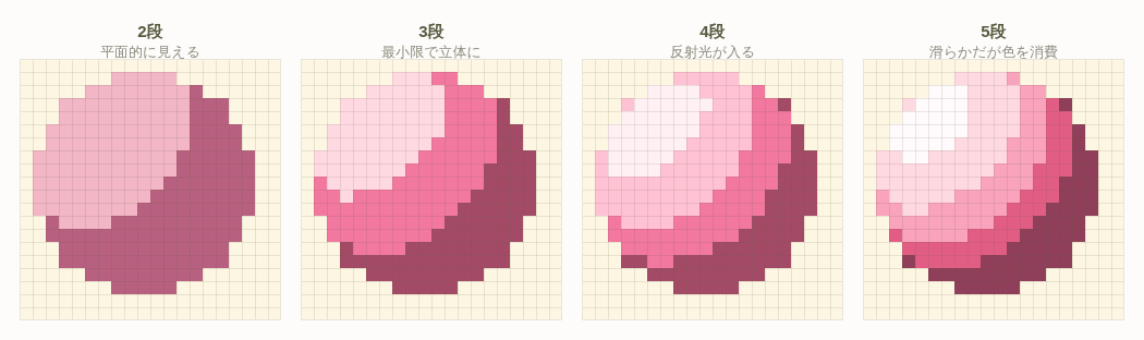
| Steps | Composition | How it reads | Color cost per motif | Best for |
|---|---|---|---|---|
| 2 | Base + shadow | Splits into two faces; flat. Reads as a color-divided shape | 2 colors | Icons, emblems, distant props, palettes of 8 colors or fewer |
| 3 | Base + shadow + highlight | Three faces, which reads as a curved surface. The minimum for volume | 3 colors | The standard for most motifs: characters, clothing, tools |
| 4 | + bounce light (or core shadow) | The object starts to feel placed inside an environment | 4 colors | The focal point of the picture, metal or ceramic surfaces |
| 5 or more | + core shadow and in-between values | Smoother, but the difference from 3 steps is small | 5+ colors | A large canvas showing a single subject |
The step from 2 to 3 is the most valuable color you will spend
A 2-step object contains only two things: the surface the light hits and the surface it doesn't. The eye interprets this as two flat planes glued together. Add a third step — the highlight — and brightness now runs light, mid, dark. At that point the brain starts to read it as brightness changing continuously, i.e. a curved surface. What creates volume is not the number of colors but the way the steps are ordered.
The corollary is that adding a fourth and fifth step does not make something that already reads as curved read as more curved. It gets smoother, but the change in impression is small. If your palette is tight, five motifs at three steps each will beat one motif at five steps.
Let area set the upper limit on steps
The other criterion for choosing a step count is area. If a step can only occupy a few dots, it will not be perceived as a surface — it will just look like scattered noise. As a rule of thumb, keep the motif's dot count divided by the number of steps at 8 dots or more.
- A round motif on a 20×20 grid (about 310 dots) — even at 5 steps each step gets about 60 dots, so there is room to spare
- A 10×10 prop (about 60 dots) — 5 steps means 12 dots each. Holding it to 3 steps (20 dots each) looks cleaner
- A 5×5 accessory (about 20 dots) — 2 steps is the ceiling. Rather than forcing a shadow in, let a single outline color carry the shape
Careful: Deciding "this whole picture will use N steps" is a recipe for failure. The correct approach is to vary the step count per motif — 4 steps on the main character's face, 2 steps on a background tree — budgeting your colors. If every part gets the same step count, the subject and the background carry equal visual weight and the viewer's eye has nowhere to land.
3. Understanding what each step does
To decide which step to add when you increase the count, you need to know what each step is responsible for. The five steps each have a distinct job and a target area.
Base color (target area 50–60%)
This is the color of the motif and the lead role. It covers the widest surface, the one angled to the light. The standard workflow is to pick the base color first and derive the other four steps from it. Put its value around 55–65% so you leave room to build both a shadow below and a highlight above. If you start with a base at 85% value, the highlight will blow out to white.
Shadow (form shadow, target area 25–30%)
The surface turned away from the light. The baseline is to drop the value 20–25% from the base color. If the base sits at 60% value, the shadow lands at 38–45%. Dropping only about 10% means the two colors become indistinguishable at a distance, which wastes one palette slot for nothing. In practice the correct amount usually feels like "maybe I went too dark."
Highlight (target area 5–10%)
The narrow, brightest surface facing the light head-on. Raise the value 18–25% from the base color. What matters most here is area: the narrower it is, the harder and glossier it reads. For a smooth material such as metal or ceramic, a few dots is enough; for a matte material such as cloth or wood you can go a little wider, but stay within one sixth of the base color's area. Painting broad highlights is the single most common beginner mistake and the main cause of washed-out, flat pixel art.
Bounce light (target area 3–5%)
Light that has bounced off the floor, a wall or a nearby object and faintly lights the rim of the dark side. Place it just inside the silhouette on the shadow side, 1–2 dots wide. It makes the object feel placed within a space and removes the cut-out look. The rule for its value is 10–15% brighter than the shadow, but never brighter than the base color. If bounce light goes brighter than the base, it reads as a second light source and the form collapses.
Core shadow (target area 3–8%)
The band immediately on the dark side of the light/dark boundary — the darkest part of the object itself. Direct light doesn't reach it and bounce light doesn't wrap around to it, so it is darker than the shadow. Drop another 10–12% of value below the shadow and, on a sphere, lay it in as a crescent band. Adding a core shadow gives the dark side three layers — dark, darker, and slightly lighter again (bounce) — and the roundness suddenly becomes convincing. This is a large part of why experienced artists' work looks so solid.
Value quick reference
Here are the target values for each step, assuming a base color at 60% value, where 100% is white and 0% is black. Treat the numbers as a starting point and adjust for material.
| Step | Target value | Difference from base | Where it goes |
|---|---|---|---|
| Highlight | 80–85% | +20 to +25% | The narrow surface facing the light head-on |
| Base color | 60% | ±0 (reference) | The wide surface angled to the light |
| Bounce light | 48–52% | −8 to −12% | 1–2 dots inside the silhouette on the dark side |
| Shadow | 38–45% | −15 to −22% | The surface turned away from the light |
| Core shadow | 28–33% | −27 to −32% | Just on the dark side of the light/dark boundary |
Notice that the bounce light sits brighter than the shadow. In other words, within the dark side the values run, from the lit side outward, core shadow → shadow → bounce light, getting brighter as you approach the silhouette. That structure — the dark side being brightest at its outer edge — is the decisive element that makes an object look round.
4. Don't mix in black — drop the value and shift the hue
When building a shadow color, the thing most people reach for is "mix some black into the base color." It feels natural if you think in terms of paint, but it reliably produces muddy results. Mixing in black means dropping value and saturation at the same time. A desaturated color drifts toward gray, so only the dark areas lose their color identity and start to look like dirt rather than shadow.
The correct procedure: drop value, rotate hue, adjust saturation
Think of the color in HSB (hue, saturation, brightness) and perform three separate operations.
- Drop the brightness (B) — 20–25% below the base for the shadow, another 10–12% for the core shadow.
- Rotate the hue (H) — shift dark areas 10–20 degrees toward blue-violet and lit areas 10–20 degrees toward yellow.
- Adjust the saturation (S) — raise the shadow's saturation by 5–15% and lower the highlight's by 10–25%.
The hue shift has a physical basis. Outdoors, the surfaces in shadow are not lit by direct sunlight but by blue ambient light wrapping in from the whole sky, which is why shadows lean blue-violet. Highlights, on the other hand, are created by the sunlight or lamp itself, which is yellow-leaning. Reproducing just these two facts makes shading look dramatically more natural at the same values.
The saturation adjustment has its own logic. Dropping only the value makes a color look drained to the eye, so you compensate by raising the shadow's saturation slightly. A highlight, meanwhile, approaches white as it brightens, so without lowering its saturation it starts to look unnaturally fluorescent.
Concrete five-step swatches
Here are five-step ramps built with those rules. They are ordered by role rather than by value so you can pick them up with the eyedropper and compare directly.
| Motif | Highlight | Base color | Bounce light | Shadow | Core shadow |
|---|---|---|---|---|---|
| Red berry | #F8A060 | #D8404C | #B0405E | #8C2C50 | #5C1C40 |
| Green leaf | #D0DC64 | #58A048 | #3E7A5E | #2C6458 | #1C4048 |
| Blue water | #A8E4E0 | #3C8CC8 | #4064B4 | #2C4C9C | #1C2C68 |
| Tree trunk | #D8AC70 | #9C6C40 | #7C5450 | #604038 | #3C2830 |
| White cloth | #FFFFF4 | #ECEAF0 | #CCC8DC | #ACA8C4 | #847C9C |
White and black motifs need special handling
Look at "white cloth" at the bottom of the table. When you shade something white,
simply dropping the value produces gray and drains the life out of the whole picture.
The correct answer for a white shadow is a pale blue-violet.
The example above uses #ACA8C4, which is clearly violet-leaning.
Seen on its own you would say "that isn't a white shadow, that's purple,"
but placed next to the white base color the brain reads it as the shadow of white without hesitation.
Black motifs are trickier still. If you set the base color to #000000
there is no darker color left, and you cannot shade it at all.
When drawing something black, set the base color at around 15–20% value
(something like #2A2632, a blue-violet-leaning near-black) and work up and down from there.
Reserve pure black for outlines and the deepest shadows only.
Checking it in the tool: Use the eyedropper in design edit mode to pick up your base color and your shadow color alternately and compare them. If the shadow color looks like "dark gray" on its own, you have mixed in too much black. If you can say "a dark, blue-violet-leaning version of that color," you got it right. The per-color highlight display also lets you see at the same time where that shadow color is actually distributed across the picture.
5. Shading by shape — spheres, cylinders, planes and cloth folds
Even with the same light source and the same five-step ramp, the way you arrange the steps changes completely with the form. Getting this wrong produces the state where "the colors are right but the shape reads as something else." Here is how the steps are arranged for four representative forms.
Sphere — concentric arrangement
A sphere darkens as you move away from a single point on the side of the light source. All the step boundaries are curves, forming concentric rings offset toward the light. The highlight is closer to a point than a surface — around 3 to 6 dots on a 20×20 sphere. The core shadow goes slightly toward the lit side of the center of the dark area, as a crescent band. Just outside that, one to two dots inside the silhouette, add the bounce light and you are done.
Cylinder — arrangement in vertical bands
The classic mistake with cylinders is applying concentric, sphere-style shading. Do that and a vertical pipe reads as a stretched ball. On a cylinder, brightness varies only horizontally and does not change vertically at all. Every step becomes a vertical band, and the highlight is not a point but a vertical line running top to bottom.
Arms, legs, tree trunks, bottles, columns — and locks of hair — are all treated as cylinders. Hair in particular is often ruined by shading the whole head as one sphere. Think of hair as a collection of cylinders (strands) and shade each strand with vertical bands; it immediately starts to look like hair.
Steps left to right, with the light at the upper left

Sphere (horizontal section)     H  B  B  S  C  S  R
Cylinder (horizontal section)   B  H  B  S  C  R
                                ^ the cylinder's left edge is slightly
                                  darker, because the rim turns away

H = highlight  B = base  S = shadow  C = core shadow  R = bounce light
Flat planes (boxes, walls, floors) — one color per face
Flat surfaces are actually the easiest to shade. Brightness does not vary within a single flat face. Use exactly one color per face and switch colors at the edges between faces. Put a gradient on a flat face and it instantly stops reading as flat — it starts to look like a bulging bag instead.
Viewing a cube from above at an angle, three faces are visible: top, front and side. With the light at the upper left, distribute the values like this.
- Top face — brightest, because it faces the sky. The base color itself, or +10%
- Front face (light side) — 15% below the top face
- Side face (away from the light) — another 15% below the front face
Just those two 15% drops are enough to make a box read properly as a cube — using only three steps. Buildings, furniture and any block-shaped object can be shaded with this same principle.
Cloth folds — keep the peaks and valleys uneven
Cloth is the hardest of the four, but the principle is simple: the peaks of the folds take base-to-highlight values and the valleys take the shadow. There are three things to watch out for.
- Do not space the folds evenly — vary the widths, for example 2 dots, 5 dots, 3 dots, 4 dots, and it starts to look like fabric. Evenly spaced folds read as stripes or roof tiles.
- Fold shadows are narrow at the top and spread toward the bottom — cloth hangs under gravity, so folds are dense and thin near the point of suspension and spread out toward the hem. This "narrow above, wide below" shape is what makes cloth convincing.
- Limit the number of folds — on a 20×20 canvas, three or four folds is the ceiling. Any more and they become 1-dot-wide stripes, which read as a pattern rather than as folds.
Careful: Adding steps will not rescue a picture whose form has been misjudged. When "I added colors and it still doesn't look solid," first put into words whether that form is a sphere, a cylinder or a plane. Sphere shading applied to a cylinder is extremely common, and no amount of extra color will fix it.
6. Cast shadow and form shadow are two different things
We say "shadow" as if it were one thing, but a picture contains two kinds of shadow with completely different natures. Failing to separate them makes the ground look discolored, or leaves objects floating.
| Aspect | Form shadow (shade) | Cast shadow |
|---|---|---|
| What it is | The object's own surfaces that the light does not reach | The shadow the object throws onto another surface by blocking light |
| Derived from | The object's own base color | The base color of the receiving surface (ground, wall) |
| Boundary | Soft on a curved surface, sharp at a hard edge | Always sharp (sharper the harder the light) |
| Shape | Follows the object's own form | The object's silhouette projected onto the receiving surface |
| Purpose | Makes the object look solid | Grounds the object in space |
A cast shadow's color comes from the ground, not the object
The most frequent error is painting the cast shadow in the object's own color. Paint a red ball's cast shadow in dark red and the ground appears to have been dyed red in that spot. A cast shadow simply receives no light; the ground's own color has not changed. So the correct color is the ground's base color with the value dropped 25–30% and the hue rotated about 15 degrees toward blue-violet. If the ground is green grass, the cast shadow is a dark, blue-green-leaning green.
Physically, light bouncing off a red ball really does tint the ground faintly red (color bleed). But in pixel art's limited palette there is almost never any value in spending a color on that effect. You can safely ignore it.
Cast shadow length is set by the light's height
- High light (midday) — a short shadow gathered almost directly beneath the object, about 0.3–0.5 times the object's height.
- Medium light (45 degrees) — the shadow's length roughly equals the object's height. On a 20×20 canvas this setting fits best.
- Low light (evening) — the shadow stretches to 2–3 times the object's height. Dramatic, but on a small canvas the shadow runs off the edge and ends up making things less readable.
Darkening the contact point removes the floating look
The one or two dots where the object actually meets the ground should be darker than anywhere else, because it is a gap that light cannot get into at all (the phenomenon known as ambient occlusion). Even if you cannot afford the colors for a full cast shadow, those one or two dark dots at the contact point are worth including on their own. That single line is enough to make the object feel like it is sitting on the ground.
If you want an object to float, invert the same technique. Place the cast shadow 1–3 dots away from directly beneath the object and omit the dark contact dots. The same drawing will then read as hovering in the air, and the greater the gap, the higher it appears to float.
7. Where to cut when colors are limited
So far we've established that fully equipped shading needs five steps. In practice, though, the total number of colors in a piece is limited. The practical working range in Heartopia Design Studio is around 15 to 25 colors, so if five motifs appear, each one gets only three or four colors. That is where knowing the order in which to cut becomes essential.
Cutting priority
| Order | Step to cut | What you lose | Merge into |
|---|---|---|---|
| 1 | Bounce light | The sense of being placed within a space | Merge into the shadow |
| 2 | Core shadow | The conviction of the roundness | Merge into the shadow |
| 3 | In-between values (5th step onward) | Smoothness of the gradient | Merge into the adjacent wider step |
| 4 | Highlight | The presence of the light source and the material | Merge into the base color |
| 5 | Shadow | The volume itself (never cut this) | — |
This order has a rationale. Bounce light goes first because it is information that improves the result rather than information the result depends on. Removing it makes the object feel slightly cut-out, but the roundness survives.
The highlight, by contrast, is cut much later than the bounce light. The highlight is the only element that directly shows where the light source is; without it, the lighting setup of the picture becomes unreadable. And the shadow can never be cut at all — the moment you remove it, the motif reverts to a flat area of color.
Share colors between ramps
Cutting is not your only option; reuse is the other. Using one motif's shadow color as another motif's base color frees up a slot immediately. For instance, the shadow color of light brown wood and the base color of dark brown soil can usually be reconciled into a single color with a small compromise on each side.
Going further, the darkest color in the picture (core shadows and outlines) can be a single shared color across every motif. Our ability to distinguish hue drops sharply in dark areas, so making the core shadow of a red motif and that of a green motif the same dark violet will almost never be noticed. That alone can save three or four colors.
An example allocation at 15 colors
Here is how you might allocate 15 colors for one character plus a simple background.
- Skin: 3 colors (base, shadow, highlight)
- Hair: 3 colors (base, shadow, highlight)
- Clothing: 3 colors (base, shadow, highlight)
- Props: 2 colors (base and shadow only)
- Background: 2 colors (base and shadow only)
- Shared darkest color: 1 (outlines, every motif's core shadow, contact points)
- Cast shadow: 1 (derived from the background's base color)
If you want four steps on the main character's face, find the color by dropping the props or the background from two colors to one. Once you can think in terms of "where do I borrow one color from," the color limit stops being a source of stress and becomes part of the fun of designing.
Putting it into practice in the tool: After converting an image, color reduction gives you two steps — "reduce rarely used colors" and "merge similar colors" — plus custom manual color reduction, where you select and merge colors one at a time. Following the priority order in this article, your first move is to pick out the mid-brightness color being used as bounce light and merge it into the shadow color. Watch the color count shown on screen and reduce step by step, as far as the picture can take it. For the details of the operation, see Noise Reduction & Color Reduction.
8. Cleaning up the shading of an auto-converted image
When you upload an image to Heartopia Design Studio, it is converted into a numbered blueprint in pixel art form. That conversion quantizes brightness and color mechanically, so it has no concept of "where the light source is." As a result, reflections and highlights from the original photograph survive as if they were shadows, making it look as though there are two light sources, or leaving the shadows blotchy. Cleaning this up by hand changes the result dramatically from exactly the same source image.
The cleanup procedure
- Fix the direction of the light source — look at the converted image and find where the brightest dots cluster. That is the light side. If the bright areas are split between two places, adopt the larger one and eliminate the other later.
- Check the distribution with the per-color highlight display — pick one of the dark colors being used as shadow and see where it is scattered across the picture. If the same dark color also appears on the light side, that is pattern or noise from the original image, not shadow.
- Kill the isolated dots — replace any in-between color that occupies only one or two dots with the wider adjacent color. Setting noise reduction to "medium" or "strong" during conversion handles most of this automatically; erase the rest by hand with the pen.
- Straighten the shadow boundary into a single line — a jagged, scattered light/dark boundary is the typical state right after conversion. Redraw the boundary as a regular staircase, for example two dots across then one dot down. Just tidying the boundary transforms the impression of the piece.
- Tighten the highlight — automatic conversion tends to produce oversized highlights. Cut the area roughly in half and concentrate it on the single point most directly facing the light. Fill the reclaimed area with the base color.
- Add the core shadow and bounce light — if you have colors to spare, add a one-step-darker band on the dark side of the light/dark boundary, and a 1–2 dot bounce light just inside the silhouette on the dark side. If you don't have the room, skip this.
- Check the contact point and the cast shadow — automatic conversion sometimes paints the cast shadow in the object's color. Pick up the cast shadow area with the eyedropper and confirm it belongs to the ground's color family; if not, repaint it. At minimum, make the one or two contact dots your darkest color.
- Step back and check — finally, move away from the screen or squint at the whole picture. If it reads as solid in that state, it's finished. Lock it in here before moving on to placing dots in block work mode.
Careful: Save your work before you start reshading by hand. Shading fixes turn into trial and error easily, and there will inevitably be a moment when you think "it was better before I touched it" and want to go back. With a save in place, you can compare and decide.
Fixes by symptom
Symptom: it looks like there are two light sources
This happens when the original image had multiple lights, or a reflection or lens flare was captured in it. The fix is straightforward: paint over the bright cluster you are not adopting with the base color. Even if it is accurate as a photograph, a single light source always reads better as pixel art. It has the side benefit of reducing your color count.
Symptom: the shadow is blotchy and never becomes a surface
The texture of the original image — the weave of fabric, skin texture, wood grain — is being picked up as differences in brightness. The fix is to raise noise reduction one level and reconvert, or to merge similar colors during color reduction to cut the number of steps. Texture is information that simply cannot be expressed at around 20×20 dots, so discard it decisively.
Symptom: it reads as solid but the whole thing looks muddy
The cause is shadow colors with too little saturation. Photographs record dark areas with reduced saturation, so converting them directly turns shadows gray. The fix is to replace the grayish colors being used as shadow with saturated dark colors. The reliable route is to merge the offending colors with custom manual color reduction and then repaint in design edit mode. Use the swatches in section 4 as a reference and swap in blue-violet-leaning shadows.
Summary — a shading checklist
Finally, here is the content of this article in a form you can refer back to while working. When your picture looks flat, go down this list in order.
- Have you fixed a single light direction? Is it consistent across every part of the picture?
- Is the value difference between base and shadow 20–25%? (About 10% is not enough.)
- Do you have at least three steps — base, shadow and highlight?
- Is the highlight's area within one sixth of the base color's?
- Did you build the shadow by mixing in black? Have you rotated the hue 10–20 degrees toward blue-violet?
- Can you say out loud whether the motif is a sphere, a cylinder or a plane? Are you applying sphere shading to a cylinder?
- Is the cast shadow derived from the ground's color? Are the one or two contact dots your darkest color?
- When colors run short, are you cutting in the order bounce light → core shadow → in-between values?
Shading does not improve simply because you add more colors. Fix the single precondition of a light source, place three steps carefully according to that logic, and you gain far more volume than any two additional colors could buy you. Start by opening one of your existing pieces and checking whether the shadow directions agree across every part of it.