How Noise Reduction and Color Reduction Work — Halving Your Build Time
Noise reduction and color reduction are usually taken for cosmetic features, but their real effect is cutting the time you spend building in the game. A photo conversion can exceed fifty colors, and most of those are colors a human eye can barely tell apart. Your hand still changes pens for every one of them. This page opens up how both features decide what to do — thresholds included — and gives you a basis for judging how far you can safely reduce.
1. Why the color count decides your build time
Placing a single pixel in the game is fast — under a second once you have the hang of it. What eats the clock is switching the pen to another color. Open the palette, find the color you want, re-select it: that sequence takes many times longer than placing one pixel.
The block work mode in this tool is designed to cut those switches. It divides the canvas into blocks and has you fill every pixel of one color inside a block before moving to the next, so the total number of switches is "block count × colors present in that block".
What happens when the color count falls
Working a 150×150 canvas in 10×10 blocks gives 15×15 = 225 blocks. Changing the average number of colors per block moves the switch count like this:
| Average colors per block | Total pen switches |
|---|---|
| 12 colors | 2,700 |
| 8 colors | 1,800 |
| 5 colors | 1,125 |
| 3 colors | 675 |
Dropping from 12 colors to 5 takes the switches from 2,700 down to 1,125. At three seconds each, that is a difference of more than two hours. Not a single pixel has been removed from the total, yet the felt workload is completely different.
The crucial point is that what matters is the per-block color count, not the overall one. You can use forty colors across the whole picture and still see only three or four in a block, provided each color is clustered in one area. Conversely fifteen colors scattered finely across the whole canvas will put all fifteen in every single block. Scatter is the enemy.
2. The rules noise reduction applies
Noise reduction absorbs "floating" pixels into the color around them. The tool starts with isolated single pixels, judged by the following conditions.
Conditions for being treated as a stray (all three must hold)
- Of the eight surrounding squares, one single color occupies five or more.
- That color differs from the color of the centre pixel.
- Of the eight surrounding squares, at most one shares the centre pixel's color.
Only when all three hold is the centre pixel replaced by the surrounding majority color. The conditions are deliberately strict so that thin lines and one-pixel highlights are not destroyed by mistake. A one-pixel-wide line, for instance, has two or more neighbours of its own color running along it, so condition 3 excludes it and it survives.
In other words noise reduction targets only pixels that are completely detached from their surroundings. A deliberately placed catchlight in an eye, or a thin outline, is generally left alone.
3. Choosing a noise reduction level
There are four levels. Every level except "off" first performs the isolated-pixel removal above, and then differs in how large an "island" it will also erase. An island is a small connected clump of a color that differs from everything around it.
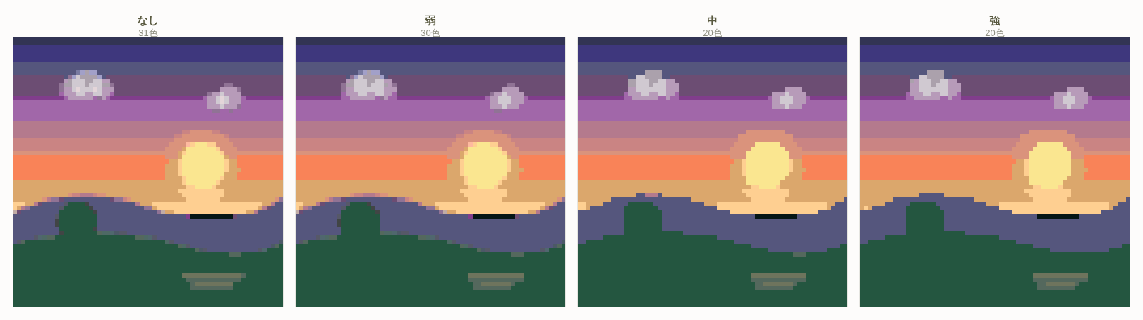
| Level | What it does | When to use it |
|---|---|---|
| Off | Nothing | When the imported image is already pixel art. When you do not want a single pixel of a hand-drawn line changed |
| Low | Removes isolated single pixels only | Illustrations and line art, where you want the detail protected |
| Medium | Strays plus islands of 2 pixels or fewer | Ordinary photos. A safe setting to try first |
| High | Strays plus islands of 3 pixels or fewer | Grainy high-ISO photos. Fine textures such as grass, gravel and fur |
What "high" will erase: removing every island of three pixels or fewer means small eyes, nostrils, distant windows and the dots in lettering can go too. On a small canvas (30×30, say) it is completely normal for facial features to be three pixels or fewer. In that case do not use "high" — stay at "low" or "medium".
Start at "medium" when unsure. Look at the result: still grainy, move to "high"; something you needed has vanished, move to "low". The tool lets you confirm in the preview before committing, so going back and forth costs nothing.
4. How color reduction picks what to merge
Color reduction cuts the color count by combining similar colors. The tool decides the merge target like this:
How the target is chosen
- Sort the colors in use by how many pixels use them, most first.
- Look for a merge target only among colors used more than this one.
- Among those, take the color with the smallest CIEDE2000 difference as the candidate.
- Protected colors such as white and black are never on the receiving end of a merge.
Because colors are absorbed into more heavily used ones, the colors of your large areas do not change. What changes are the colors that were barely used. That is how the color count falls while the overall impression stays intact.
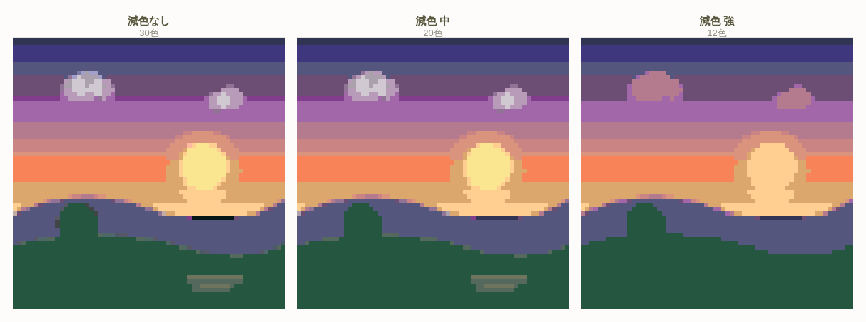
Whether a merge is recommended or not comes from the combination of color difference and usage count.
| Condition | Treatment | Meaning |
|---|---|---|
| Color difference below 5.0 | Merge recommended | Practically the same color. Combining changes almost nothing visually |
| Used on fewer than 100 pixels and close in color | Merge recommended | Only occupies a tiny area. Removing it has little impact |
| Close in color, but neither of the above | Optional | You can merge if you need to, but the look may change |
What a color difference of 5.0 means: among this tool's 142 palette colors, the closest pair differs by 1.9 (#E7D5D4 and #E9D5D0) — a difference the eye essentially cannot resolve. "Below 5.0" is only a modest widening of that same "practically identical" range: a level you would not notice without placing the two side by side. Which is exactly why you can apply the recommended merges without hesitation.
5. How far you can safely reduce
The more you reduce the easier the build gets, but past a limit the picture falls apart. The right color count depends on the subject and on the canvas size.
| Subject | Target color count | Watch out for |
|---|---|---|
| Logos, icons, symbols | 2–6 | Fewer colors actually tightens the design |
| Anime-style illustration | 8–16 | Keep at least three colors for skin shading |
| Landscape photos | 16–24 | Cut the sky gradient too far and you get banding |
| Portrait photos | 20–32 | Skin gradation is everything. Cut here and it turns unnatural immediately |
The other axis is canvas size. Put a large color count on a small canvas and each color covers only a few pixels — no visual benefit, all of the extra build weight.
Thinking about the ceiling from canvas size
You want at least around 30 pixels per color. By that measure a 900-pixel 30×30 tops out at about 30 colors and a 2,500-pixel 50×50 at the equivalent of 80, but the smaller the picture, the better it looks with the color count held down — the outlines read more clearly. Keeping a 30×30 to 6–10 colors and a 50×50 to 10–16 gives you the clarity that makes pixel art look like pixel art.
6. When to use manual color reduction
There are situations the automatic recommendations do not reach. For those you can specify which color to remove by hand; the removed color is absorbed into its nearest neighbour automatically.
Case 1: you want the background to be one color
A faint gradient left in the background splits a large area into finely divided colors, and every block ends up containing several background shades. Manually merging the close background colors into one can make 20×20 blocks viable in a single stroke. This is the highest-impact operation on the page.
Case 2: you want to protect one specific color
A character's eye color, a logo's brand color — there are colors that are "barely used but absolutely must stay". Automatic reduction merges from the least-used colors upward, so exactly these can disappear. Exclude them from the operation by hand.
Case 3: one color has split into two
The palette contains colors separated by as little as 1.9, so a surface that should be one flat color can split into two because of slight unevenness in the photo. It is hard to spot visually, so scan the color list and check whether two entries that look identical are sitting next to each other. Delete one of them and that surface resolves cleanly into a single color.
7. What happens when you overdo it
Too much noise reduction
- Small features such as eyes and noses disappear
- Thin lines — branches, power cables — break up
- Patterns flatten and texture is lost
- Outlines round off and sharpness drops
Too much color reduction
- Banding — a smooth gradient develops visible steps
- Broken faces — skin shading drops to two colors and looks either flat or dirty
- Loss of form — shadow becomes a single color and everything reads as flat
- Color collision — colors that were distinct get absorbed into one and can no longer be told apart
If banding appears, restoring a color is not the only option — dithering is another. It alternates two colors so the eye reads an intermediate shade, letting you express gradation while keeping the color count low. See Dithering and Gradients for the details.
8. The recommended order of operations
Steps
- Apply noise reduction at "medium" first — clearing the strays first tidies the color list and makes the reduction decisions easier.
- Adjust the level from the result — something you needed vanished, go to "low"; still grainy, go to "high".
- Apply the automatic recommendations as they are — anything below 5.0 in color difference is essentially the same color, so there is nothing to agonise over.
- Scan the color list — check whether identical-looking colors are sitting side by side.
- Consolidate the background — pull the background to one color by hand. The biggest single win.
- Check in the block preview — on the block size screen, count the color numbers appearing in one block. Three or four is plenty.
Doing the noise reduction first is the key. In the other order you reduce colors while still carrying colors that would have been erased as noise, and your judgement is clouded.
It works on inserted images too: color reduction can be applied individually to a region where you later dropped in a separate image. If you placed different images in the front cover, spine and back cover zones of a book, you can tidy the color count zone by zone.
9. Summary
- Color count affects build time more than appearance. Twelve colors per block down to five takes switches from 2,700 to 1,125.
- What counts is colors per block, not colors overall. Scatter is the enemy.
- Noise reduction fires only when five or more of the eight neighbours share one color and at most one matches the centre. Thin lines survive.
- "Medium" erases islands of 2 pixels or fewer, "high" 3 or fewer. "High" is dangerous on a small canvas.
- Color reduction absorbs into the more heavily used color, so your large areas keep their color.
- A color difference below 5.0 means "practically identical". Apply the recommended merges without hesitation.
- The biggest single win is consolidating the background into one color.
- The order is noise reduction → color reduction. Reversed, your judgement is clouded.