How Images Are Converted to Pixel Art, and Which of the Three Methods to Use
Feed in the same photo and change the conversion method, and the result differs considerably. But if you pick on the basis of "method 2 somehow looks nicer", you cannot reproduce that success when the subject changes. This page opens up what the conversion in this tool is actually doing — down to the real numbers — and then sorts out which method belongs with which kind of subject. Once you understand the mechanism, you can also work out for yourself how to fix a result you do not like.
1. Inside the conversion — how a color is chosen
The colors available in Heartopia are fixed. This tool holds that 142-color palette and, for every pixel of your source image, decides which of those 142 is closest.
The important part is that the comparison is not made in RGB. Numeric distance in RGB does not match the difference a human eye perceives. So the color is first converted into Lab color space — a representation built around human perception — and compared there.
How one pixel's color is settled
- Convert the source pixel's color to Lab.
- Compute a rough distance against all 142 palette colors and keep the six nearest as candidates.
- Re-run a high-accuracy color-difference calculation — CIEDE2000 — on those six only.
- Commit to whichever had the smallest difference.
The two stages exist for speed. CIEDE2000 is accurate but expensive, and a 150×150 canvas holds 22,500 pixels; running it for every pixel against all 142 colors would not be fast enough to use. Narrowing to six candidates with the cheap calculation and then being precise gives both accuracy and speed.
Results are also reused when the same color appears repeatedly. That caching is why an image with a flat background finishes converting so quickly.
How dense the palette is: the two closest colors among the 142 are only 1.9 apart in color difference (#E7D5D4 and #E9D5D0) — essentially indistinguishable to the eye. In other words the palette contains several near-identical colors, and converting a photo can therefore mix in different color numbers that look the same. That is one reason color counts balloon, and it is exactly what the color reduction feature exists to tidy up.
2. What the three methods actually change
The difference between methods 1, 2 and 3 is how the original color is adjusted before it is matched to the palette. The matching itself (Lab → six candidates → CIEDE2000) is identical in all three. These are the coefficients actually applied:
| Method | Brightness | Contrast | Saturation | Color selection |
|---|---|---|---|---|
| Method 1 (Standard) | none | none | none | Nearest color to the original |
| Method 2 (Illustration / Simple) | ×1.03 | ×1.05 | ×1.10 | Prefers base colors |
| Method 3 (High Contrast) | none | ×1.25 | ×1.12 | Prefers base colors |
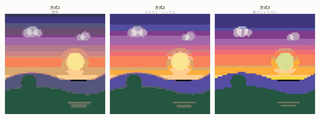
The numbers look like small differences, yet the results diverge considerably. There are two reasons.
Reason 1: contrast pushes the shadows and the highlights apart at the same time
Contrast adjustment spreads values away from 128 (mid brightness) in both directions. At method 3's ×1.25, a region at brightness 200 moves to 218, while one at brightness 50 moves to 31. The darker something already was, the more it darkens, so shadow gradation collapses into black en masse. That is the real mechanism behind "it looks crisper, but the information in the dark areas is gone".
Reason 2: "prefers base colors" changes which palette entry wins
Methods 2 and 3 favor the base color among entries of the same hue over whatever the raw color-difference calculation picked. As noted above, the palette holds colors separated by as little as 1.9, so under method 1 a tiny amount of image noise can push neighbouring pixels onto different color numbers. Methods 2 and 3 consolidate those onto the base color, and the color count drops as a result. The reason they are described as suiting illustrations is less about the raised saturation than about this tidying effect.
There is also a custom setting where you specify brightness, contrast, saturation and the number of tonal steps yourself. If you want something between methods 2 and 3, or want only the saturation raised, that is where to do it.
3. Quick reference: which method for which subject
| Source image | Recommended | Why |
|---|---|---|
| Landscape and portrait photos | Method 1 | On smoothly graded subjects, no adjustment is the least likely to break down |
| Anime-style illustration, character art | Method 2 | Tidies the color count of art that already has clear color areas, while keeping outlines intact |
| Logos, icons, lettering | Method 3 | You want boundaries strongly separated, and nothing is lost when the shadows crush |
| Overcast or backlit photos that look flat overall | Method 3 | The ×1.25 contrast bites and the flatness improves |
| Night scenes and dark photos | Method 1 | Method 3 collapses the dark regions into a single black |
| Illustrations that are already highly saturated | Method 1 | Adding more saturation with method 2 or 3 saturates the color and the gradation disappears |
When in doubt, compare all three. The method selection screen shows the three results side by side. If they look equally good at thumbnail size, pick the one that appears to use the fewest colors — it will make the build much easier. When visual preference is a tie, color count is the tiebreaker.
4. Images that convert well, and images that do not
Converting to pixel art is a process of throwing information away on a large scale. Converting to a 150×150 canvas means compressing a 3000×3000 photo down by a factor of four hundred. Whether the image still works after that discard is what decides the result.
What makes an image suitable
- The subject is large in frame — filling at least a third of the picture reads clearly
- Subject and background differ in brightness — a difference in hue alone tends to vanish on shrinking
- Simple shadows — one direction of cast shadow, no complicated reflections
- Few colors to begin with — illustrations, product shots on a plain background
- Clear outlines — not blurred, not dissolving into backlight
What makes an image unsuitable
- The information sits in fine detail — group photos, signage with small text, a wide view of an intricate pattern
- Uniform brightness — white clothing against a white wall. Shrink it and everything becomes one color
- Hair, fur, grass — a mass of thin lines turns into a grey blob when reduced
- Gradation as the subject — a photo of nothing but a sunset sky will band once dropped onto the palette
- High-ISO photos with heavy noise — the grain becomes scattered color directly
Rather than forcing an unsuitable image through, you get a better result by choosing a different subject. Group shots and wide landscapes in particular work far better as pixel art if you commit to cropping in and making one subject large.
5. Getting the crop right
The single most important thing about the crop is matching the aspect ratio of the destination. Heartopia canvases have fixed ratios, and the faces of clothing and furniture go to further extremes.
| Destination | Pixels | Crop orientation |
|---|---|---|
| Canvas 1:1 | 150×150 | Square |
| Canvas 16:9 | 150×84 | Landscape |
| Canvas 9:16 | 84×150 | Portrait |
| T-shirt front | 64×80 | Slightly portrait |
| T-shirt sleeve | 64×48 | Slightly landscape |
| Sweatshirt sleeve | 130×70 | Strongly landscape |
| Dress inner | 168×102 | Strongly landscape |
| Floor lamp base rim | 128×16 | Extremely landscape (a strip) |
Place an image without matching the ratio and it will either be stretched or have its edges cut off. The crop screen in this tool is locked to the destination's ratio, so what you see on screen is exactly what you get. Pinch and drag to check that the subject sits inside the frame.
Placing a face: when the subject is a person, putting the eye line about one third down from the top of the frame gives a stable result. Centred, the forehead margin reads as too wide once the image shrinks and the balance breaks.
Do not put photos on extremely thin faces: the floor lamp's base rim is 128×16. Put a photo there and sixteen pixels of height cannot show what it is. Handle strip-shaped faces with a single color or a two-to-three-color stripe.
6. Judging whether you have enough resolution
"A high-quality source gives beautiful pixel art" is not true. What matters is not the megapixel count but how many pixels the subject occupies at the destination size.
Rough guide for faces
- Face height under 10 px — eyes, nose and mouth cannot be told apart. No expression comes through
- 10–20 px — the positions of eyes and mouth read. Hard to tell who it is
- 20–40 px — expression appears. It starts working as a likeness
- 40 px and up — hairstyle and facial outline identify the individual
Put a full-body photo on a 64×80 T-shirt front, for example, and the face is only a handful of pixels. In that case give up on the full body and crop to the face alone, or switch the subject from a person to a logo or a silhouette — the result will look far better.
On a 150×150 canvas, by contrast, a generous crop can give the face over 100 pixels of height, which is enough for genuinely photographic rendering. The smaller the destination, the simpler the subject must be — that is the underlying principle.
7. The order to check things in when it goes wrong
When you are not happy with a result, changing settings at random makes the cause impossible to find. Check in this order — the items are listed from largest effect downwards.
1. Is the crop right?
Is the subject too small? Is there too much empty margin? This is the most common cause and the one you can fix most effectively. Suspect the crop before you touch the conversion method.
2. Is the precision (pixel count) enough?
Are you putting a detailed subject on a coarse setting? On a canvas, raising the precision one step can be all it takes. Remember that the workload rises in proportion to area.
3. Does the method suit the subject?
Are you using method 3 on a dark photo? Are you stacking method 2 onto an already vivid illustration? Line up all three and re-pick the one with fewer colors and surviving outlines.
4. Have you cleaned up noise and color count?
If it looks grainy, or the color count is needlessly high, noise reduction and color reduction fix it. See Noise Reduction & Color Reduction for the details.
5. Finish by hand
Automatic conversion is a starting point, not a finished piece. Nudging an eye one pixel, joining up a broken outline — you can do all of that directly in the editor. It is not unusual for a few pixels of correction to change the whole impression.
8. Summary
- Conversion runs in two stages: convert to Lab → shortlist six candidates → settle with CIEDE2000. The palette has 142 colors.
- Method 2 applies brightness ×1.03, contrast ×1.05, saturation ×1.10; method 3 applies contrast ×1.25, saturation ×1.12.
- Methods 2 and 3 prefer base colors, so the color count drops. That tidying effect, more than the saturation, is why they suit illustrations.
- Method 3 is wrong for dark photos — the shadows crush together.
- Conversion discards information. Choosing a subject that survives the discard matters more than any setting.
- Match the crop to the destination ratio. Never put a photo on a strip-shaped face such as 128×16.
- For a face, secure at least 20 pixels of face height. If you cannot, change the subject.
- Fix in this order: crop → precision → method → noise and color reduction → manual touch-up.