Pixel Art Basics & Glossary — A Beginner's Introduction
For most people starting out in pixel art, the first obstacle is not drawing — it is vocabulary. Palette, color reduction, dithering, anti-aliasing, banding: tutorials and editing tools throw these words around as if everyone already knows them. And as long as you are unsure what each one actually refers to, even good advice slides right past you.
This page is an introduction in two halves. The first half explains pixel art as a form of expression; the second half is a practical glossary. In the first half we look at what pixel art really is, how it differs from a simply downscaled illustration, why anti-aliasing is so awkward to handle in pixel art, and why such a constrained medium still draws people in. In the second half, roughly 24 of the most common terms from pixel art and image processing are each explained in a few sentences. You can read the glossary straight through, or come back to it as a dictionary whenever an unfamiliar word turns up.
1. What Pixel Art Is — Placing One Pixel at a Time
Pixel art is artwork in which the artist deliberately places individual pixels — the smallest units that make up a screen — one by one. What matters in the definition is not that the picture is small, but that each pixel is there as the result of a decision rather than an accident. Choices are made at the level of "should this eye highlight sit one pixel to the right?" or "should this outline be one step darker?" That granularity of decision-making is the single biggest thing separating pixel art from other kinds of drawing.
The form originally emerged from technical constraints. On early computers and home game consoles, the number of pixels that could be displayed, the number of colors available at once, and the memory available to store an image were all limited to a degree that is hard to imagine today. Artists therefore had to communicate "what this thing is" using very few pixels and very few colors. Making a human face read at a few dozen pixels across, distinguishing trees from rocks with a handful of colors — those accumulated solutions grew into a distinctive, almost symbolic visual language.
What is interesting is that the style did not disappear once hardware improved and the constraints went away. If anything, the constraints themselves came to be chosen consciously, as the grammar that gives the artwork its appeal. Most people drawing pixel art today are not forced into low resolutions and small palettes by technology; they impose those limits on themselves because of the density and decisiveness that only appear under such conditions. You could say the constraints turned from a necessity into a style.
2. How a Downscaled Image Differs from Pixel Art
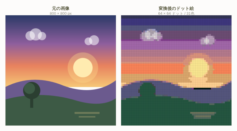
Shrinking a photo or an illustration will certainly give you an image with visibly coarse pixels. But that is not generally called pixel art. The differences come down to three points.
- Whether the pixels carry intent. In a plain downscale, the color of each output pixel is decided mechanically as an average of several source pixels. It is not the result of an artist deciding "this should be one step brighter," so the image fills up with meaningless in-between colors.
- Whether the colors are managed. In pixel art you narrow down the colors in advance and give each one a role — base, shadow, highlight, outline, and so on. A downscaled image balloons to thousands or tens of thousands of colors, with near-identical shades scattered everywhere.
- Whether the shape still reads. Pixel art redesigns the forms so that the silhouette survives within a limited pixel count. A downscale forces the original shapes into the smaller grid, so thin lines and fine patterns collapse into mush.
None of this means downscaling is bad in itself. When you build pixel art starting from an image, you simply need a process that moves the "mechanical downscale" toward a "managed, few-color picture." The noise reduction and color reduction you apply after uploading an image to Heartopia Design Studio are exactly that process. Think of them as cleaning up the meaningless in-between colors produced by averaging, and keeping only the colors that mean something in the picture — the settings suddenly make much more sense.
3. Why Anti-Aliasing Is Hard to Handle in Pixel Art
Anti-aliasing is the technique of placing intermediate colors along the edges of diagonal and curved lines so that the stair-stepping (jaggies) becomes less noticeable. In ordinary image processing it is applied automatically and in large quantities. It is why text looks smooth and why photo edges look natural.
In pixel art, though, that "automatic and in large quantities" quality becomes a problem, for three main reasons.
- The color count explodes. Smoothing a single diagonal line already requires several intermediate shades. Apply that automatically to a picture with dozens of lines and the palette grows unmanageable almost instantly.
- The picture goes muddy. Intermediate colors have lower contrast than the originals, so the whole outline looks as if a hazy film had been laid over it. At low resolution each pixel carries a lot of weight, and that muddiness ends up defining the impression the piece makes.
- It fights your intent. In pixel art, jaggies are not necessarily a flaw. When the pixel steps line up in a regular rhythm, they read as a deliberate line in their own right. Automatic anti-aliasing destroys that regularity indiscriminately.
For this reason, anti-aliasing in pixel art is not a question of on or off, but of where, how many steps, and placed by hand. You might add a single intermediate shade only along the boundary between two large areas, and none at all on fine details or the outer silhouette. Performing that selective treatment manually is one of the core skills of the medium.
Worth remembering: photos and anime-style illustrations already contain a great deal of anti-aliasing. Convert them straight to pixel art and you get rows of half-committed intermediate colors along every edge. If you feel that "the outlines look blurry" or "the color count refuses to drop," suspect this as the cause. Merging similar colors with color reduction usually cleans it up nicely.
4. Why Pixel Art Still Appeals Today
In an era when high-resolution artwork can be produced without limit, why go out of your way to draw with coarse pixels? There are several answers.
The first is that the finish line is close. At sizes like 32×32 or 64×64 you are handling a few hundred to a few thousand pixels in total, which keeps a single piece within a realistic amount of work. You are freed from the endless anxiety of "it still needs more detail," and you get the satisfaction of having filled a finite space completely.
The second is that decisions become clear. Because both pixels and colors are limited, you are always forced to choose: if this line stays, that one has to go. The work becomes less about what to draw and more about what not to draw, and as a result the subject of the picture comes through sharply. Training yourself to communicate with little information pays off well beyond pixel art.
The third is the pleasure of reading it. The viewer recognizes forms by filling in the missing information from a coarse arrangement of pixels. That act of completion is satisfying in itself, and it produces the moment when a cluster of simple shapes suddenly looks like a living character. You could argue that the "cuteness" of pixel art really comes from this participation on the viewer's side.
Finally, it is easy to share. Because the structure is simple, it is easy to look at someone else's work and figure out how they placed each pixel. Count the squares and anyone can reproduce the same thing — that transparency makes pixel art unusually easy to learn from and to imitate. The numbered "blueprint" that Heartopia Design Studio outputs is built on exactly this readability.
5. Glossary (1): Images and Canvas Basics
| Term | Meaning |
|---|---|
| Pixel / Dot | The smallest square unit that makes up a digital image. One pixel holds exactly one color. "Dot" is used almost interchangeably; in Japanese, "dot" tends to be used from the artist's point of view and "pixel" from the image-data point of view. In pixel art production, this single square is the smallest unit of decision-making. |
| Resolution | How many pixels tall and wide an image is. A 64×64 image contains 4,096 pixels in total. Higher resolution lets you draw finer detail, but it also multiplies the work of placing every pixel. In pixel art, the real skill lies in how much you can convey at a low resolution. |
| Canvas | The area you draw in, and its size. In Heartopia Design Studio you pick a canvas type and precision (dot count) that corresponds to a design frame in the game, and there is also a free canvas mode for arbitrary sizes. Choosing a canvas before you start is the same as choosing the upper limit on how much information the picture can hold. |
| Sprite | A small image such as a character or item that is handled separately from the background. It began as a technical term for an image that could be moved independently on screen, but today it is widely used as a general name for a single pixel-art figure or object. |
| Tile | A reusable square fragment of artwork meant to be laid out repeatedly to build backgrounds and surfaces. Design the edges so they connect on all four sides and the tiles can be placed seamlessly. Because it covers a large area with very little source material, tiling is a common approach for patterns and ground textures. |
| Transparency / Alpha | Information indicating that nothing is drawn at a given pixel. The alpha value expresses opacity: 0 is fully transparent and the maximum value is fully opaque. Pixel art usually avoids partial transparency and treats every pixel as either transparent or opaque, which keeps the outline crisp. |
| Blueprint | A working diagram that shows, with a color number, which color goes in each square. Heartopia Design Studio converts an uploaded image into pixel art in this format. It is an output designed for the workflow of looking at the blueprint and reproducing the picture one square at a time inside the game Heartopia. |
6. Glossary (2): Color and Palettes
| Term | Meaning |
|---|---|
| RGB | A way of expressing color by mixing three intensities of light: red, green and blue. Displays produce color through this combination, and each component is commonly expressed in 256 steps from 0 to 255. All three at 0 gives black; all three at maximum gives white. |
| Color code | A notation that writes each RGB component as two hexadecimal digits, prefixed with #. #FF0000 is red, #000000 is black, #FFFFFF is white. It is the shared format for telling someone a color or reproducing the same color in a different tool. |
| Hue, saturation, brightness | A way of describing color along three axes closer to human perception. Hue is the kind of color — red, yellow, blue; saturation is its vividness; brightness is how light or dark it is. Palette decisions such as "keep a firm gap in brightness and shift the hue slightly toward the shadows" are much easier to reason about on these three axes. |
| Palette | The set of colors you have decided to use in a piece. Fixing the palette before drawing keeps the colors from drifting and gives the whole image a coherent feel. In pixel art the palette determines most of the impression a piece makes, so it is considered as important as the drawing itself. |
| Indexed color | A scheme in which each pixel stores not a color but a number pointing to an entry in the palette. It keeps the data small, and swapping the palette contents recolors the entire image at once. The color numbers on a blueprint follow the very same idea. |
| Color reduction | The process of reducing how many colors an image uses, by merging similar shades or folding rarely used colors into a nearby one. Color reduction in Heartopia Design Studio has two steps: step 1 removes colors that appear in only a few squares, and step 2 merges colors that are similar to each other. A "custom" mode also lets you pick colors and merge them by hand. |
| Quantization | The general term for rounding continuously varying values into a fixed set of levels. Applied to color, quantization means assigning each of countless possible colors to one of the limited entries in a palette. Color reduction is a form of color quantization, and the criteria used to decide which entry a color rounds to changes the result. |
| Color difference | A numeric measure of how different two colors look. You can simply compute the difference in RGB values, but the human eye is more sensitive to changes in green and less sensitive to changes in blue, so a "perceptual color difference" matched to how things actually look is often used instead. Conversion method 1 in Heartopia Design Studio assigns colors on the basis of this perceptual difference. |
7. Glossary (3): Rendering and Finish Quality
| Term | Meaning |
|---|---|
| Anti-aliasing | The technique of placing intermediate colors along the edge of a line or outline so the stair-stepping looks smooth. Ordinary image processing applies it automatically, but in pixel art it inflates the color count and muddies outlines, so the standard practice is to place it by hand, minimally, and only where it is needed. |
| Jaggies | The staircase appearance of diagonal and curved lines, or the individual steps themselves. It is unavoidable at low resolution, but in pixel art it is not necessarily a flaw. Keep the spacing of the steps regular and the result reads as a deliberate, attractive line. |
| Dithering | Alternating two colors in a regular pattern, such as a checkerboard, so that from a distance the eye is fooled into seeing an intermediate shade. It expresses gradients and texture with very few colors, but overuse makes the picture look grainy. In pixel art it is usually confined to broad areas. |
| Banding | The effect where a gradient breaks into visible stepped bands. It happens more easily with fewer colors, and unintended bands make a piece look cheap. In pixel art you reduce it by staggering the boundaries between colors or by rethinking the number of brightness steps. Adjusting the color reduction settings can also lessen it. |
| Noise | Meaningless isolated dots or tiny clumps of color that stand apart from their surroundings. It appears especially often in artwork converted from photos, where it adds work at the keying-in stage without contributing anything visually. Noise reduction in Heartopia Design Studio offers four strength levels: none, low, medium and high. |
| Outline | The line running around the edge of a subject. You can enclose the whole shape in a dark color, omit the line on the lit side, or drop lines entirely and define the form through differences in brightness alone — and the choice changes the mood of the piece considerably. Outlines also serve to separate the subject from the background. |
| Silhouette | The outer shape that remains when the subject is filled with a single color. Checking that the silhouette alone tells you what the thing is, before anything else, is standard practice in pixel art. If the silhouette does not read, no amount of interior detail will get the idea across. |
| Cluster | A group of same-colored pixels sitting next to one another. Ragged, irregular clusters make the image look grainy, while tidy ones make it look crisp. The "cleanliness" of pixel art is said to depend far more on the shape of its clusters than on any individual pixel. |
8. Connecting the Terms to Actual Operations
The real benefit of learning this vocabulary is being able to name the problem in front of you. Once "it just looks messy somehow" turns into "there is too much noise," "banding is showing," or "the outline is muddied by anti-aliasing," the fix follows naturally.
The same mapping makes the settings in Heartopia Design Studio much easier to choose. The conversion methods differ in how color difference is evaluated and how the image is pre-processed (method 1 is based on perceptual color difference; method 2 raises brightness and contrast before converting; method 3 emphasizes contrast and saturation). Noise reduction tidies up isolated dots, and color reduction shrinks the palette and moves the image toward indexed color. Around 15–25 colors is the comfortable working range; stay within it and keying the picture in from the blueprint becomes far easier.
While placing pixels, you can switch between "block work mode," which advances in 10×10 square blocks, and "normal work mode," which shows the whole picture. The per-color highlight display lets you see at a glance where the clusters of a given color are scattered. The design editing mode goes further, letting you redraw dots directly with tools such as the pen, or bring in another picture with the image insertion feature. Finished pieces can be saved to your account, published with a share URL, or posted to the Community Gallery.
Pixel art asks you to learn surprisingly little, yet it goes surprisingly deep. Start by keeping this page nearby as a dictionary, and finish one piece for real. The moment the words connect with what your hands are doing, pixel art becomes dramatically easier to work with.