Outlines and Jaggies — How to Draw Lines That Look Smooth
Have you ever looked at your pixel art and thought "the shapes are right, but the lines look rough"? Diagonals break into visible steps, an outline gets thicker in one place and thinner in another, and something that should be round ends up looking angular. All of this falls under the name jaggies, and it isn't a matter of skill — it comes from the basic nature of placing a diagonal line on a square grid.
The key insight is that jaggies are not something you remove — they're something you make consistent. Every piece of pixel art whose lines look smooth is still made of stair steps when you zoom in. The only difference is how those steps are cut. This article starts with why diagonals look jagged in the first place, then covers how to even out your steps, how to fix the three ways lines commonly break, step patterns for specific angles and curves, how to decide whether to outline at all, how to choose an outline color, and finally a concrete workflow for cleaning up the outlines that come out of an image conversion.
1. Why diagonal lines look jagged
A pixel art canvas is a grid of perfect squares laid out in rows and columns. On that grid there are exactly three kinds of line you can draw with no irregular steps at all: horizontal, vertical, and a diagonal at exactly 45 degrees. Horizontal and vertical lines are a single straight run of pixels; a 45-degree line moves one pixel diagonally each time. Nothing uneven ever appears.
Every other angle has to be approximated with a staircase. If you want a line that drops one pixel for every three it travels sideways (about 18.4 degrees), you place three pixels in a row, drop one, place three more, and repeat. That alternation of "a flat run of three" and "a one-pixel drop" is what a pixel art diagonal really is. The steps themselves are physically unavoidable. That's the starting point.
When jaggies actually become visible
The presence of steps is not the problem. The problem is steps that are irregular. Human vision is extremely good at finding repeating patterns, so when every flat run is the same length and they're evenly spaced, the eye reads them as one line at a consistent slope. But when the runs go 2, 3, 2, 5, 3 and so on, there is no pattern to find, and the longer runs get perceived as bumps sticking out of the line. Those bumps are the jaggies.
In practice, three specific situations cause trouble.
- The steps are not the same length — a run of 2-2-3-2-4-2 makes the 3 and the 4 stand out, and the line looks kinked at those points.
- A single step drops two or more pixels — instead of descending one pixel at a time, the line jumps two, and that spot reads as a break in the line. As a rule, steps should always descend by exactly one pixel.
- The line's thickness wobbles — when one line contains both one-pixel-wide and two-pixel-wide sections, the thick parts look darker and the thin parts look faded, so the line appears to break apart or to grow lumps.
In other words, making a line look smooth is not about "removing the steps." It's about keeping three things constant: the length of each flat run, the height of each step, and the thickness of the line. That principle runs through the rest of this article.
2. Even out the steps and the eye fills in a straight line
The reason pixel art can look smooth at all comes down to visual completion. Nothing but angular squares exists on screen, and yet when the brain sees regularly spaced steps, it interprets them as "there is really a straight line here." It's the same mechanism that makes a halftone-printed photograph look like continuous tone from a normal viewing distance.
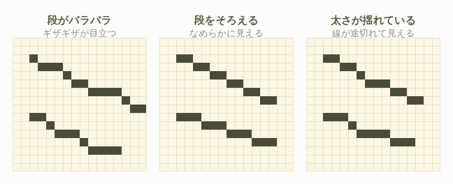
Step length maps directly to angle
Choosing a step length is the same thing as choosing an angle. A line that drops one pixel for every n pixels of horizontal travel sits at arctan(1/n). Here are the values you'll actually use.
| Step pattern | Approx. angle | Look and typical use |
|---|---|---|
| 1-1-1-1 (shift one pixel each time) | 45° | The smoothest of all. Roofs, swords, flags, diagonal folds |
| 2-2-2-2 | about 26.6° | Gentle slopes, cheek lines, the leading edge of a wing |
| 3-3-3-3 | about 18.4° | Wide forms, sloping ground, ship hulls |
| 4-4-4-4 | about 14.0° | Long, nearly horizontal lines. Horizons, table edges |
| 1-2-1-2 (alternating) | about 33.7° | Halfway between 45° and 26.6°. The workhorse intermediate angle |
| 2-3-2-3 (alternating) | about 21.8° | Halfway between 26.6° and 18.4° |
As the table shows, the angles you can build from simple repetition are surprisingly few: essentially 45, 33.7, 26.6, 21.8, 18.4 and 14 degrees. The distinctive "look" that pixel art has comes largely from the fact that it is built out of only these few angles. Which means the fastest route to clean lines is to pick the closest angle from this table and commit to it for the whole line. If you try to reproduce the exact angle in your photo or illustration to within a degree, your steps will inevitably become irregular and the line will fall apart.
Tip: Once you've chosen a step pattern, the golden rule is to never change the run length partway through a line. If you genuinely need a different length, change it at a corner where the line meets another part, not in the middle of a straight run. At a corner the eye already expects the direction to change, so a change in run length passes unnoticed.
Check both zoomed in and zoomed out
You can only judge step consistency when zoomed in, but you can only judge whether something looks smooth at or near actual size. The design editing mode in Heartopia Design Studio has zoom in and out, so make a habit of the round trip: zoom in to count your runs, zoom out to see the overall impression. If you stay zoomed in the whole time, you'll obsess over single pixels and lose the larger balance. Zooming out to look at the whole piece roughly once every five minutes is about the right rhythm.
3. The three ways lines break, and how to fix each
When a line looks bad, the cause is almost always one of three patterns. Look at your own work and decide which one applies.
Break 1: Run lengths are inconsistent
Symptom: The line travels in the right direction overall, but it kinks like an elbow in places. Zoom in and you'll find run lengths mixed together, something like 2-2-3-2-1-2-3.
Cause: You traced the source image pixel by pixel. Lines in a photo or illustration sit at continuous angles, so dropping them onto a grid always leaves remainders. An automatic conversion leaves those remainders in place too.
The fix: First, count which run length appears most often in that line. If 2 appears five times, 3 twice and 1 once, your baseline is 2. Then correct the 3s and the 1 to 2. Shortening runs makes the whole line shorter, so pin both endpoints in place and only adjust the middle. When the line's length isn't a clean multiple of your baseline, put the leftover in one place at an end rather than in the middle, where it would be conspicuous.
Break 2: Thickness wobbles between one and two pixels
Symptom: The line doesn't read as an even weight — some spots look like dark clumps, others look faded out. This happens on outlines especially often.
Cause: At a step transition, the last pixel of one run and the first pixel of the next end up adjacent both horizontally and vertically, forming a 2×2 block. This is the classic pixel art flaw known as a double pixel. In the diagram below, the left side shows a 2×2 block at the transition; the right side shows the correct form, where the runs touch only at a corner.
Broken (2x2 block)         Correct (corner contact)
■■・・・・                 ■■・・・・
■■・・・・                 ・・■■・・
・・■■・・                 ・・・・■■
・・■■・・                 ・・・・・・
The fix: Of the four pixels in the block, delete the one that bulges inward relative to the line's direction of travel. If you can't decide which to remove, keep whichever choice makes the line thinner. Keeping the thicker option leaves the line looking stubby. Since you're erasing exactly one pixel, zoom in before you do it.
Break 3: The curvature changes abruptly on a curve
Symptom: You drew a circle or ellipse, but part of it looks flattened, or a corner pokes out. It's most visible on round subjects like heads and fruit.
Cause: On a curve, run lengths are supposed to change — but the way they change is disordered. Where the sequence should decrease and then increase monotonically, like 4-3-2-1-1-2-3-4, you instead have something like 4-2-3-1-2-1-4 that goes back and forth. The curvature ripples and the shape stops reading as round.
The fix: Run lengths along a curve must be either strictly increasing or strictly decreasing as you move from the apex toward the ends — never both alternately. Find the one place where the direction of change reverses, fix that single spot, and the impression changes dramatically. Also, never repeat the same run length three or more times in a row — a curve built that way looks like a straight line. Two repeats is the practical maximum.
Careful: If you try to fix a broken line by adding pixels to fill gaps, it will almost always get thicker and worse. The rule for jaggy repair is subtract before you add. Remove the surplus pixels first to even out the runs, and only add a minimal number of pixels if the line still reads as broken afterward.
4. Angles and curves — concrete step patterns
This section collects the step patterns you'll want when drawing angles other than 45 degrees, and when drawing curves. Once these are memorized, you'll spend far less time guessing.
Build intermediate angles from two run lengths in strict alternation
To get an angle exactly between 2-2-2 and 3-3-3, you'd need a run of 2.5 pixels — which doesn't exist — so you alternate 2 and 3 instead: 3-2-3-2-3-2. What matters is that you maintain the alternation all the way to the end. If the order collapses into 3-2-3-2-2-3-3-2, only the spot where it collapsed will look kinked.
Good (3-2-3-2)             Bad (3-2-2-3-3-2)
■■■・・・・・・・         ■■■・・・・・・・
・・・■■・・・・・         ・・・■■・・・・・
・・・・・■■■・・         ・・・・・■■・・・
・・・・・・・・■■         ・・・・・・・■■■
The same idea gives you finer angles. 2-2-3-2-2-3 (a 3 every third step) gives a slightly gentler angle than 2-2-2, and 3-3-2-3-3-2 gives a slightly steeper angle than 3-3-3. The point is to keep the period constant: once you decide "every third step," hold that period to the end of the line. As long as the period is regular, the eye accepts the pattern even though the lengths are mixed.
| Slope you want | Step pattern | Period | Notes |
|---|---|---|---|
| Slightly gentler than 45° | 1-1-2-1-1-2 | 3 steps | about 37°. Good for arm and leg contours |
| Between 45° and 26.6° | 1-2-1-2 | 2 steps | about 33.7°. The most frequently used intermediate angle |
| Slightly steeper than 26.6° | 2-2-1-2-2-1 | 3 steps | about 31° |
| Slightly gentler than 26.6° | 2-2-3-2-2-3 | 3 steps | about 24° |
| Between 26.6° and 18.4° | 2-3-2-3 | 2 steps | about 21.8° |
| Slightly gentler than 18.4° | 3-3-4-3-3-4 | 3 steps | about 16.7° |
Draw one eighth of a circle and mirror the rest
If you place a full circle by eye, the left and right or top and bottom will almost certainly disagree. The reliable method is to draw only one eighth of the circle (a 45-degree wedge) carefully, then mirror it. The procedure:
- Decide the center and radius, and lay down vertical and horizontal guides. The guide line feature in design editing mode keeps the center from drifting.
- Starting from the top (the twelve o'clock position), place pixels clockwise for 45 degrees only. Run lengths should be long (flat) near the apex and shrink monotonically toward 1 as you approach the 45-degree mark — something like 5-3-2-2-1-1.
- Mirror that eighth across the 45-degree diagonal to make a quarter.
- Mirror the quarter horizontally to make a half, then vertically to complete the circle.
- Finally, check the seams — top, bottom, left, right, and the four diagonal points — to make sure the run length hasn't accidentally doubled there. If it has, remove one pixel.
Note that circles with an even diameter and circles with an odd diameter treat the center differently. With an odd diameter (say 15 pixels) the center lands on a single cell, while with an even diameter (say 16 pixels) the center falls at the junction of four cells, which forces the flat part at the apex to be an even number of pixels. The smaller the circle, the easier an even diameter is to keep symmetrical, so for small rounds in the 8 to 16 pixel range, choosing an even number gives more stable results.
On an S-curve, switch the direction of change at the inflection point
An S-curve — flowing hair, a piece of cloth catching the wind — changes which way it bends partway along. That switching point is the inflection point, and it is exactly where the run length should be at its longest. In other words, something like 1-1-2-3-4-4-3-2-1-1: the curve flattens out in the middle before bending back the other way. If the run stays short at the inflection point, that spot becomes a corner and the S reads as a sharp V.
5. Deciding whether to outline at all
Everything so far has been about drawing clean lines, but whether you should draw an outline in the first place depends on the subject. There are three main approaches.
Approach A: Enclose in a dark outline (full outline)
Wrap the whole silhouette in a one-pixel dark border. Because the shape stays readable against any background color, this is powerful on small canvases and on pieces where the background gets busy. It suits characters, icons, logos and signage — anything where "instantly recognizable" is the top priority.
The drawback is area. On a 16-pixel-square canvas, a one-pixel outline leaves you 14×14 = 196 cells inside, meaning about 23% of the piece is consumed by the outline. At 32 pixels square that drops to about 12%, so as a rough guide, a full outline becomes comfortable once your shortest side is at least 24 pixels.
Approach B: Show it as a silhouette (no outline)
Draw no outline at all and let the value difference between the subject and the background define the shape. This suits soft things, glowing things, distant scenery, clouds, smoke and water — subjects where a hard boundary would look unnatural.
The condition for it to work is value contrast. Unless the outer part of the subject differs from the background by at least 30% in lightness, the shape dissolves into the background and stops being legible. If you choose this approach, fix the background's value first and pick the subject's colors afterward. Our color palette guide covers this in more detail.
Approach C: Outline only the shadow side (selective outline)
Omit the outline on the lit side and draw a dark border only where the form falls into shadow. Real objects behave the same way: the lit edge blends into the background, while the shadowed edge stays distinct. As a result this approach reads as the most three-dimensional of the three, and it's the standard choice for characters and still-life subjects on medium to large canvases.
The one requirement is to decide your light direction up front. If light comes from the upper left, you outline only the lower right. As soon as the direction varies from part to part, the piece looks wrong.
| Approach | Suits | Recommended canvas | Color cost |
|---|---|---|---|
| A Full outline | Characters, icons, logos, emblems, signage | 24 pixels per side or more (smaller works but leaves little interior) | 1–2 colors (reusable) |
| B No outline | Clouds, smoke, water, distant scenery, glowing objects, background elements | No limit (requires 30%+ value contrast with the background) | 0 colors (nothing added) |
| C Selective outline | Characters, still life, buildings, anything needing volume | 32 pixels per side or more is easiest to handle | 1 color per subject |
A quick decision rule: Look at your piece at the size it will actually be displayed. If the subject occupies less than 20 pixels of width, use approach A; between 20 and 40 pixels, approach C; more than that, and with enough value contrast available, approach B or C. You won't go far wrong with this. The smaller the subject, the more it needs an outline.
6. Outline color — why a darkened base color beats pure black
Once you've decided to outline, the next question is the color. Pure black (#000000) is tempting as a default, but in most cases it isn't the best choice. There are three reasons.
Reason 1: Black stands apart and crushes the interior values
The eye reads light and dark relative to the darkest thing on screen. Use pure black for the outline and it becomes that reference, so the difference between the interior shadow and the base color feels smaller by comparison. The volume you carefully built with value steps ends up looking flat. Keep the outline at "the darkest color within that object" rather than "the darkest color in the picture," and the interior value differences get read properly.
Reason 2: Material character disappears
If skin, metal, cloth and leaves are all bordered by the same pure black, every part starts to look like a sticker cut from the same material. Just varying the outline color per subject makes skin look soft, metal look hard and leaves look fresh. An outline doesn't only describe shape — it describes what something is made of.
Reason 3: Real shadows aren't black
An edge looks dark because that surface is turned away from the light. Surfaces turned away from the light still catch bounced light from the sky and their surroundings, so they never go fully black. Bringing that fact into pixel art, an outline color should be dark, slightly saturated, and shifted a little toward the cool side.
How to build it
In practical numbers, apply all three of the following at once.
- Drop lightness 25–35% from the base color — one step darker than your shadow color, which is typically 20% down. Go beyond 40% and it becomes indistinguishable from black, so stop there.
- Raise saturation 5–15% — lowering lightness alone pushes a color toward gray, so add saturation back to keep the hue alive.
- Shift hue 10–20 degrees toward the cool side (blue/violet) — this reproduces the sky light bouncing into shadow.
| Subject | Base color | With pure black | Recommended outline |
|---|---|---|---|
| Skin | #F0B890 | #000000 (hard, looks dirty) | #8C5A58 |
| Red clothing | #D04040 | #000000 (the fabric looks like a board) | #6E2038 |
| Green leaves | #5AA048 | #000000 (looks withered) | #1E4A40 |
| Metal | #A8B0C0 | #000000 (looks heavy) | #3C4258 |
| Wood | #B08050 | #000000 (looks charred) | #5A3A34 |
When pure black is the right answer
There are exceptions. In these situations black is correct.
- Icons and logos — when instant recognition at a distance outranks everything else. Legibility scales directly with outline contrast.
- Very light or white backgrounds — when you want the maximum possible value contrast, black is the surest way to get it.
- Extremely limited palettes — at eight colors or fewer you can't afford a separate outline color per subject. One shared dark color for everything is the rational choice. Even then, a very dark navy or a very dark brown will tighten the image up more than a true black.
Careful: After choosing an outline color, always check its contrast against the background as well. If the outline and the background sit at similar lightness, the outline dissolves into it and the shape falls apart. On dark pieces, consider making the outline lighter than the base color rather than darker. What an outline needs is not darkness — it's separation from the background.
7. Cleaning up converted outlines by hand
When you upload an image to Heartopia Design Studio, it becomes a numbered "blueprint" pixel pattern. The outlines at that stage are simply your original image's outlines dropped onto a grid, so all the breaks described above — uneven runs, wobbling thickness, disordered curvature — are still present. Fixing them by hand changes the result so much that it's hard to believe it came from the same source image. Here is the workflow.
- Reconsider the conversion method first — before touching a single pixel, switch between Method 1 (standard, perceptual color difference), Method 2 (illustration / simple) and Method 3 (high contrast) and compare. For illustration-style subjects where you want crisp outlines, Methods 2 and 3 often come out with tidier lines from the start, which cuts your manual work substantially. One minute of comparison here saves thirty minutes of pixel pushing later.
- Use noise reduction to knock out stray pixels — a single odd-colored pixel sitting beside an outline will throw off your reading of the runs. Set noise reduction to weak or medium to thin those out first. Be aware that the strong setting can erase thin lines and small patterns entirely, so on a piece where the outline is the star, stay at weak or medium.
- Reduce colors until the outline uses only one or two — right after conversion there are usually several intermediate colors clustered around the outline. Use the two-step color reduction (removing rarely used colors, then merging similar ones) plus custom manual reduction to consolidate the outline down to one or two colors. A total of 15 to 25 colors is the comfortable working range. If the outline is spread across three or more colors, you won't be able to tell what counts as the outline in the next step.
- Use per-color highlighting to isolate the outline — select the outline color and highlight it, and only the cells using that color light up. In this view, gaps, over-thick sections and stranded islands are obvious at a glance. Breaks that you'd never notice in the normal view — because your eye is drawn to the picture itself — surface immediately here.
- Zoom in and even out the runs on the longest straight sections — start with the longest diagonal in the piece. Count the runs, decide on the most common length as your baseline, and correct the exceptions with the pen and eraser. Jaggies are most visible on long lines, so fixing these alone transforms the overall impression.
- Delete the 2×2 blocks (double pixels) — walk along each step transition and erase one pixel from any 2×2 clump you find. As a rule, cut in the direction that makes the line thinner.
- Smooth the run progression on curves — find the rounded sections and check that run lengths change monotonically. Correcting the one or two places where the direction of change reverses is usually enough to restore roundness.
- Finalize the outline color — once the shapes are clean, replace pure black with a color 25–35% darker in lightness than the base color. The fill tool lets you replace a connected run of outline in one action.
- Zoom out to check, and go back if needed — don't call it finished while still zoomed in. Zoom out to something near actual size, and if anything still reads as kinked, repeat steps 5 through 7.
How to pace the work: Block work mode saves your progress in 10×10 cell units, which pairs well with the "finish one block at a time" rhythm for outline cleanup. But a diagonal that crosses a block boundary will end up misaligned at the seam if you only fix one side of it. Fix your long lines end to end first, then move to block-by-block work.
How far should you go?
Trying to perfect every line will never end on a large canvas. If you need to prioritize, use this order.
- The outer silhouette of the subject — visible from the greatest distance, so it has by far the best return on effort.
- Outlines around the face, or around whatever is the focal point — this is where the viewer's eye lands first.
- Straights and curves of 8 pixels or longer — jaggies on short lines are barely perceived.
- Small interior patterns — leave these for last. If you run out of time and never touch them, the piece will look essentially the same.
Put the other way around: you don't need to fix uneven runs on lines shorter than about 5 pixels. Short lines end before the eye has a chance to look for a pattern, so they aren't registered as jaggies at all. Spend your limited time on the long lines.
8. Summary
Making pixel art lines look clean comes down to five things.
- You can't remove the steps — even them out. Keep three things constant: run length, step height (one pixel as a rule), and line thickness.
- Pick your angle from the table. Work from 45°, 33.7°, 26.6°, 21.8°, 18.4° and 14°, and build intermediate angles by alternating two run lengths on a fixed period.
- On curves, change run lengths monotonically. Never repeat the same length more than twice. For circles, draw one eighth and mirror it.
- Decide whether to outline based on subject and size. The smaller it is, the more it needs an outline. For volume, use a selective outline on the shadow side only.
- Avoid pure black for outlines. Drop lightness 25–35% from the base color, raise saturation 5–15%, and shift hue 10–20 degrees toward the cool side.
With those five in mind, open one of your own pieces, zoom in, and count the runs on its longest diagonal. If the lengths are all over the place, that's the single highest-impact fix available in that piece. Once you've experienced how a few pixels can change the way a line reads, you'll start being able to look at a freshly converted blueprint and know immediately what needs fixing.