Patterns and Tiling — How to Build Repeating Motifs for Clothes and Backgrounds
If you design clothes or backgrounds, sooner or later you hit the same question: what do I do about the pattern? Leaving it plain feels empty. But scattering dots on instinct somehow looks messy. And when you try to fill the whole area, the rhythm collapses partway through and an unnatural line runs across the piece. That "somehow messy" feeling almost never comes from a lack of taste — it comes from a flaw in how the repeat was designed.
The good news is that a repeating pattern is finished the moment you build one small tile correctly; after that you just lay copies of it down. This article starts with the mechanics of why tiles connect without seams, then covers how to choose a tile size, the concrete dot-by-dot steps for classic patterns — checkerboard, stripes, gingham, houndstooth, scales and seigaiha — the half-drop technique that hides the regularity, and finally the practical cautions for using patterns on clothes and behind a subject. The goal is that by the end, facing a blank canvas, you can start by deciding "how many cells should my tile be?"
1. How tiling works — why one tile can cover an infinite plane
Designing a repeating pattern comes down to a single rule: "the right edge of the tile continues directly into the left edge, and the bottom edge continues directly into the top edge." Draw one square that satisfies this, and copying it across and down produces a seamless pattern that extends as far as you like.
Put another way, a tile is not a flat square of paper. It is best imagined as a surface that has been rolled into a tube, with the ends of that tube joined into a doughnut. The rightmost column and the leftmost column are physically far apart, but once the tiles are laid out they are always neighbors. The same is true of the top and bottom rows. So while you are designing, you have to keep thinking "the dot at this edge will end up next to the dot at the opposite edge."
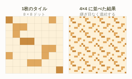
A motif that straddles the edge is correct, not a mistake
Most people building their first pattern try to fit the motif neatly in the middle of the tile. That does produce a pattern, but it also guarantees an even margin between every pair of motifs, and the result looks obviously like "things placed on a chessboard grid" — monotonous at a glance.
The tile in the figure above does the opposite: the motif deliberately straddles the edges. A dot cut off at the right edge continues at the left edge; a dot cut off at the bottom continues at the top. Built this way, once the tiles are laid down you can no longer tell where the tile boundaries are, and the whole pattern reads as one continuous piece of fabric. How good a pattern looks is decided almost entirely by how you use the edges.
Tip: When you want to check the seams while building a tile, create a state where the tile is laid out two across and two down — four copies in total. A 2×2 layout lets you verify the right-to-left join, the top-to-bottom join, and the four-corner join all at once. Staring at a single tile will never reveal a broken seam.
The advantage pixel art has here
When you build a repeating pattern on paper or in a vector illustration program, handling the edges becomes a fight with fractional coordinates. Pixel art has none of that trouble. Cells can only be counted in whole numbers, so "the dot I placed three cells in from the right edge will connect to the dot how many cells in from the left edge of the next tile?" is something you can work out exactly by counting on your fingers. Repeating patterns are in fact one of the subjects best suited to pixel art.
2. Choosing a tile size — 4×4 / 8×8 / 16×16
The first number to settle before you draw anything is the size of a single tile. Decide it carelessly and you will always run into the "the edge is left over as an awkward remainder" problem. There are two clear criteria.
Criterion 1: pick a number that divides the side length of your canvas
This is the most important one. If the tile's side length does not divide the side length of the area you want to fill, a tile will inevitably be cut off partway at the edge. For example, laying 5-cell tiles across a 32-cell-wide area gets you to 30 cells after six tiles, leaving 2 cells where only the left half of a seventh tile peeks out. Those 2 cells remain as an unnatural strip.
Numbers like 32, 48 and 64 all contain powers of two, so 4, 8 and 16 divide them cleanly. The reason 4×4 / 8×8 / 16×16 became the standard tile sizes in pixel art is not mere convention — it is that the side lengths of commonly used canvases are usually divisible by 4 or 8. Even when you can specify any size you like, as in this tool's free canvas mode, making the side length a multiple of 8 when you plan to use a pattern will make every later step easier.
| Tile size | Cells per tile | What it can express | Best used for |
|---|---|---|---|
| 2×2 | 4 cells | Checkerboard, fine stripes, noise-like texture | Adding texture. More of a "grain" than a pattern |
| 4×4 | 16 cells | Checkerboard, dot patterns, fine checks | Small parts; accents on sleeves and collars |
| 8×8 | 64 cells | Gingham, houndstooth, scales, polka dots | The most versatile. Garment bodies, background ground patterns |
| 16×16 | 256 cells | Seigaiha, floral motifs, multi-motif combinations | Large canvases; patterns meant to be the main attraction |
Criterion 2: work backwards from how much information the tile must hold
The other criterion is how many cells the motif itself needs. To make a polka dot read as a "circle" at all you need at least 3×3 cells, and to make it look like a decent circle you need 5×5. Allow roughly the same amount of empty space around it and a polka dot pattern needs a tile of at least 8×8. Trying to fit a circle into a 4×4 tile just gives you a square blob, not a circle.
Conversely, a pattern whose shape is the whole point — houndstooth, for instance — starts to fail if you blow it up to 16×16, because each motif becomes so prominent that the result reads as an illustration rather than a pattern. A pattern only works if it reads as a single surface when seen from a distance, so avoid sizes where one motif takes up more than about an eighth of the whole picture.
How this relates to Block Work Mode: This tool's Block Work Mode divides the design into 10×10 cell regions and tracks your progress block by block. If you use 8×8 tiles, the block divisions and the tile divisions do not line up. That is not a drawback — it means that every block necessarily contains parts of several tiles. The same stretch of pattern shows up repeatedly within one block as you place cells, so each time you finish a block you naturally end up verifying that the pattern is continuing correctly. On the other hand, if you deliberately give the pattern a 10-cell period, one block equals one tile, and you can repeat exactly the same procedure for every block — an advantage when you want to power through repetitive work quickly.
3. The three classic seam failures and how to fix them
When a pattern is not working, the symptoms fall into roughly three categories. Each has a clear cause and a clear fix, so find the one that matches what you are seeing.
Failure 1: the motif is cut off at the edge and its shape breaks there
Symptom: once tiled, a line of half-motifs runs along the tile boundary. A single column or row is visibly different from everything around it.
Cause: you placed the motif so that it straddles an edge, but you never drew the continuation on the opposite edge. If you drew the left half of a circle at the right edge, the right half of that circle must exist at the left edge.
Fix: a motif that straddles an edge must always be drawn in two places. The procedure is simple: decide the center coordinates of the circle, and if the circle overhangs the right edge by x cells, draw that overhanging portion again starting x cells in from the left edge. Top and bottom work identically — overhang the bottom by y cells and you draw y cells' worth at the top. If the motif straddles a corner, you need fragments in all four places, so be careful not to forget one.
Failure 2: the motif sits too close to the edge and merges with its neighbor
Symptom: each individual motif is drawn correctly, yet when tiled, two motifs look fused into a larger mass and that area reads as denser than the rest.
Cause: the distance from the motif to the tile edge is too small to serve as the spacing between motifs. Inside the tile it may look like "there are three cells to the edge, that's plenty," but if the next tile also has only three cells at its edge, the actual gap is 3+3, not 6 — and it is often narrower than the spacing inside the tile.
Fix: as a rule, place the motif's center exactly half the spacing away from the edge. For a single motif in an 8×8 tile, put the center at (4,4); for two motifs, put them at (2,2) and (6,6) — the one-quarter and three-quarter positions of the tile. Do this and the cross-tile spacing automatically matches the within-tile spacing.
Failure 3: the density differs vertically and horizontally
Symptom: looking at the whole pattern, only the vertical lines seem emphasized, or a horizontal band appears to run across the piece.
Cause: the tile is square but the motif layout inside it is not. Put two motifs horizontally and one vertically in an 8×8 tile and the horizontal spacing is 4 cells while the vertical spacing is 8 — a factor-of-two difference in density. Human vision reads the denser direction as a "line," so an unintended stripe appears.
Fix: make the center-to-center distance the same vertically and horizontally. If you genuinely want a different number of motifs in each direction, the correct move is to make the tile itself rectangular. Two motifs across and one down in an 8×4 tile gives 4-cell spacing in both directions. Note that on a garment where you actually want the vertical line emphasized, you can use this density difference on purpose.
Caution: trying to fix a broken seam after you have already filled the canvas is a nightmare. Noticing a single wrong cell after dozens of tiles are down means correcting that cell in every one of them. Always finish one tile, verify it in a 2×2 layout, and only then expand it across the whole area. Following that order alone can cut your working time by more than half.
4. Building the basic patterns — eight worked examples
From here on it is hands-on. Every diagram below represents one 8×8 tile. ■ is the dark color and □ is the light color (the ground). Where a third tone is needed, ▨ marks the mid tone. Copy them cell for cell and you will have each pattern.
Polka dots
The simplest pattern, and the one that hides mistakes least. Place two single-cell dots in an 8×8 tile, offset diagonally — for instance at (1,1) and (5,5). A single dot in the center produces strong vertical and horizontal lines, so always use two dots placed on a diagonal.
□□□□□□□□
□■□□□□□□
□□□□□□□□
□□□□□□□□
□□□□□□□□
□□□□□■□□
□□□□□□□□
□□□□□□□□
To enlarge the dots, expand each cell into a 2×2 block. If a 2×2 block ends up straddling a tile edge, do not forget to draw the remaining half on the opposite side. Once a dot reaches 3×3 or larger the impression shifts from "polka dot" to "circle print," so if you are aiming for something cute, staying at one or two cells is the safe choice.
Stripes
For vertical stripes, make the tile width equal to one full stripe period. A stripe of 2 cells of line and 2 cells of ground means a tile 4 cells wide (or 8 cells for two periods). Vertical stripes require no thought about the top and bottom edges at all, making them the hardest pattern to get wrong.
■■□□■■□□
■■□□■■□□
■■□□■■□□
■■□□■■□□
■■□□■■□□
■■□□■■□□
■■□□■■□□
■■□□■■□□
The practical tip here is to avoid making the line width and the ground width equal. An even 2:2 stripe looks mechanical and monotonous. Go 3:1 (thick line, thin gap) or 1:3 (thin line, wide ground) and the same two colors suddenly look far more refined. In this tool's design editing mode, turning on the guide lines and then drawing with the shape tool lets you lay down perfectly even stripes very quickly.
Checks (grids)
A grid is vertical stripes and horizontal stripes overlaid. In an 8×8 tile, draw vertical lines on columns 0 and 4, and horizontal lines on rows 0 and 4, and you get a 2×2 arrangement of 4×4 squares. The points where the lines cross automatically become denser, which is enough to read as a grid.
■■■■■■■■
■□□□■□□□
■□□□■□□□
■□□□■□□□
■■■■■■■■
■□□□■□□□
■□□□■□□□
■□□□■□□□
The key is putting the lines on row 0 and column 0. Doing so places a line at the tile's left and top edges, so when tiles meet, the lines do not double up and every square in the grid comes out the same size. Put the lines on row 1 and column 1 instead, and the squares straddling the tile boundary become one cell wider — and that shows.
Checkerboard
To build a checkerboard in an 8×8 tile, alternate 4×4 blocks in two colors. Dark in the top-left and bottom-right, light in the top-right and bottom-left. This is one of the rare patterns that connects correctly without you having to think about the edges at all.
■■■■□□□□
■■■■□□□□
■■■■□□□□
■■■■□□□□
□□□□■■■■
□□□□■■■■
□□□□■■■■
□□□□■■■■
Changing the block size changes the impression dramatically. A 1×1 checkerboard blends optically into a "surface of an intermediate color," so it functions as dithering rather than as a pattern. At 2×2 it starts to read as a checkerboard, and at 4×4 it becomes an unmistakable geometric pattern. Using the fill tool lets you paint block by block, which makes the work go much faster.
Gingham
Gingham is a pattern that expresses the overlap of colored bands crossing vertically and horizontally as a third color. White over white gives the ground color, white over color gives the mid tone, and color over color gives the dark tone. Simply honoring those three steps immediately makes it convincing as cloth.
■■■■▨▨▨▨
■■■■▨▨▨▨
■■■■▨▨▨▨
■■■■▨▨▨▨
▨▨▨▨□□□□
▨▨▨▨□□□□
▨▨▨▨□□□□
▨▨▨▨□□□□
The procedure: first fill everything with the ground color (□), then paint a 4-cell-wide vertical band in the mid tone (▨), then paint a 4-cell-wide horizontal band in the mid tone over it, and finally replace only the square where the two overlap with the dark tone (■). Set the mid tone to exactly halfway in brightness between the dark tone and the ground. If the mid tone leans too close to the dark tone the result reads as a checkerboard; too close to the ground and it reads as a grid.
Houndstooth
Houndstooth is a checkerboard whose blocks each grow a two-cell-wide "tooth" running out diagonally. It comes from a twill weave, so built accurately it fits neatly into 8×8. Copy the layout below exactly.
■■■■□□■■
■■■■■□□■
■■■■■■□□
■■■■□■■□
■■□□□□□□
□■■□□□□□
□□■■□□□□
■□□■□□□□
Understanding the structure lets you adapt it. The top-left 4×4 is solid dark and the bottom-right 4×4 is solid ground. Between them, a two-cell-wide diagonal band runs toward the lower right. That diagonal band is the "tooth" of houndstooth, and it is the only reason the pattern does not look like a plain checkerboard. The diagonal band always folds around and reconnects at the tile edge, so count the two cells at each edge carefully when placing them.
Uroko (scales)
A traditional Japanese motif built from triangles tiled alternately point-up and point-down. In an 8×8 tile, place two upward-pointing triangles, offset horizontally by half a tile and stacked vertically.
□□□■■□□□
□□■■■■□□
□■■■■■■□
■■■■■■■■
■□□□□□□■
■■□□□□■■
■■■□□■■■
■■■■■■■■
The upper triangle has its apex in the center; the lower triangle has its apex split across the left and right edges of the tile. Seen alone, the bottom half looks like a "valley," but lay the tile next to its neighbor and the fragment at the left edge and the fragment at the right edge merge into one complete triangle. This is the textbook example of an edge-straddling motif. Widen the triangle's slope by one cell per row — that 45-degree angle looks the most natural.
Seigaiha and other offset arrangements
Seigaiha is a motif of concentric arcs overlapped with a half-step offset. Drawing the arcs themselves in dots is hard, so start by building one arc 8 cells wide and 4 cells tall, then place it again in the lower band shifted 4 cells sideways.
□□■■■■□□
□■□□□□■□
■□□□□□□■
□□□□□□□□
■■□□□□■■
□□■□□■□□
□□□■■□□□
□□□□□□□□
Look at the lower half. Shifting the upper arc four cells to the right leaves the arc's left half at the tile's right edge and its right half at the tile's left edge. On a single tile the shape looks meaningless, but the instant you tile it, the same arc as the upper band appears. To get closer to real seigaiha, make the arc two or three concentric lines rather than one, with the inner lines darker to create depth. In that case, enlarge the tile to 16×16 so you have room to work.
5. Half-drop offsetting to kill the grid lines
The biggest single cause of the "cheap" feeling you get from a tiled pattern is that the motifs line up straight vertically and horizontally, so grid lines become visible. Human vision insists on connecting aligned points into lines, so an evenly spaced grid layout will always produce visible vertical lines, horizontal lines, and eventually diagonals as well.
The classic technique for eliminating this is the half-drop. The method is simple: take the second row of motifs and shift it sideways by exactly half a period relative to the first. If you have two motifs in an 8×8 tile, offset the horizontal position of the lower one by 4 cells (half a period) from the upper one.
Comparing the two
First, the un-offset grid layout. You can see straight lines running both vertically and horizontally.
□□□□□□□□
□■□□□■□□
□□□□□□□□
□□□□□□□□
□□□□□□□□
□■□□□■□□
□□□□□□□□
□□□□□□□□
Now the same thing with only the lower row shifted by 2 cells — half a period in this layout.
□□□□□□□□
□■□□□■□□
□□□□□□□□
□□□□□□□□
□□□□□□□□
□□□■□□□■
□□□□□□□□
□□□□□□□□
It is a shift of just two cells, but the vertical lines disappear and a gentle diagonal flow takes their place. That diagonal flow is hard for the eye to follow, so the pattern registers as "surface texture" rather than "a collection of lines." Whenever you want something to look like fabric, you will almost always want this treatment.
Choosing how far to offset
- Half-drop (1/2) — the default. Some regularity remains, but the vertical and horizontal lines are reliably gone. When in doubt, use this.
- Third-drop (1/3), also called a brick offset — returns to the original alignment after three rows. It looks less regular than a half-drop and gives a more natural scatter, but the tile height must be a multiple of three.
- Quarter-drop (1/4) — produces a strong diagonal flow, giving the pattern a clear sense of direction. Useful when you want movement, though on clothing it can fight with the flow of the fabric.
Tip: you do not have to offset horizontally — vertical offsets work too. A vertical offset is called a half-brick and produces a bricklaying look. Combine a vertical offset with a horizontally striped base, or a horizontal offset with a vertically striped base, and you keep the directionality of the original stripe while removing only the monotony.
Caution: using a half-drop makes the effective repeat unit larger. To build an 8×8 pattern with a half-drop, the tile has to contain the offset state as well, which in practice means preparing a tile twice as tall, such as 8×16. Forget this and build at 8×8 anyway, and the motif you thought you offset snaps back to its original position. An offset arrangement must always include both rows within the tile.
6. Making a pattern look rich with very few colors
Patterns cover a lot of area, so adding colors to them squeezes your whole palette very quickly. For a garment design you want to spend at most about three colors on the pattern, keeping the rest for the collar, cuffs and decorative details. The structure that works here is "two related colors plus one accent."
| Role | Colors | Target area | Function |
|---|---|---|---|
| Ground | 1 | 55–70% | Sets the overall impression of the pattern. Occupies the largest area |
| Pattern color (related) | 1 | 25–40% | Close in hue to the ground, differing mainly in brightness. Forms the skeleton of the pattern |
| Accent | 1 | 3–8% | A contrasting hue. Used on a very small area only |
Two related colors for ground and pattern
Making the ground and the pattern related in hue — that is, keeping the hue close and changing only the brightness — gives you something that reads as a calm solid color from a distance but reveals a pattern up close. It is a very refined result. Aim for a brightness difference of 15–25%. Under 10% and the pattern is invisible; over 40% and the pattern shouts too loudly.
Rather than simply lightening and darkening the same color, combine this with the hue-shifting technique described in the color palette guide. Shifting the darker color 10–20 degrees toward the cool side and the lighter one 10–20 degrees toward the warm side gives even a two-color pattern real depth as a fabric.
Keep the accent narrow and structured
The rule for the third, accent color is to use it on only one or two cells per tile, never scattered across the whole pattern. In gingham, for example, place one cell of yellow at the center of each dark square. In houndstooth, change only the cell at the tip of each tooth. That alone makes a two-color pattern read as though it carries more than three colors' worth of information.
The critical point is not to scatter the accent randomly. Random placement still shows up regularly once the tile repeats, so you end up looking regular anyway — and because the intent is unreadable, it reads as dirt rather than design. Always put accents in positions that mean something structurally: the center of a square, the intersection of two lines, the tip of a motif.
Tip: when you want to check the color balance of a pattern, this tool's per-color highlight display is useful. Lighting up just one color shows you at a glance how much area that color occupies across the whole pattern. If highlighting your accent color makes the screen light up in blotches, that is a sign you have overused it. The ideal is a scattering of small points covering roughly 5% of the area.
7. Clothes vs. backgrounds — designing for area and contrast
At this point you can build the patterns themselves. What remains is where to put them and how. A pattern on a garment and a pattern behind a subject need completely different properties. The first half of this section covers clothes, the second half backgrounds.
Clothes: small areas crush the pattern
A pattern for a background and a pattern for clothing come from different design philosophies. Clothing has a small area and an irregular shape, so bringing a background pattern over unchanged will almost certainly break down.
A clothing design frame has far fewer usable cells than a canvas frame, and even within that, only part of it — the body and the sleeves — can actually take a pattern. If the body area is, say, roughly 12 cells tall by 10 cells wide, an 8×8 tile fits little more than once. That is not a pattern; it is a large shape.
As a rule of thumb, a pattern needs at least three periods, preferably four or more, to read as a pattern. To put a pattern in a 12-cell-tall area, the tile side should be 4 cells or less, and ideally 2–3 cells. On clothing, tiles of 4×4 and below are the workhorses, and 8×8 should be thought of as a large-scale print.
| Side length of the patterned area | Recommended tile size | Periods that fit | How it reads |
|---|---|---|---|
| Around 8 cells | 2×2 | 4 | Fine texture. Reads almost as an intermediate color |
| 12–16 cells | 4×4 | 3–4 | The lower limit for reading as a pattern. Practical |
| 24–32 cells | 8×8 | 3–4 | The best balance |
| 48 cells or more | 16×16 | 3 or more | Large scale. You can enjoy the shape of the motif |
Clothes: how you handle the boundaries decides the result
The biggest fork in the road is what you do with the pattern at the garment's outline and at the joins between parts like the collar and the cuffs. There are three options.
- Let the outline cut the pattern off — the most natural option and the closest to real cloth. Draw the pattern using the whole canvas as the coordinate reference, then erase whatever falls outside the garment shape. The pattern positions then line up between the sleeve and the body, as though the garment were cut from a single piece of fabric.
- Rebuild the pattern for each part — lay out the sleeve so its motif is centered in the sleeve, and the body so its motif is centered in the body. It looks neatly contained, but the pattern breaks at every part boundary, so the impression is less "cloth" and more "printed panels sewn together."
- Vary the pattern per surface — pattern on the body, plain on the sleeves, for instance. This sidesteps the crushed-pattern problem in small parts entirely, making it the safest option in a small design frame.
Whichever you choose, the principle is never to lay the pattern on top of the outline. When the dark color of the pattern lands on a cell of the outline, the outline looks either thicker or broken, and the silhouette becomes hard to read. If you are painting the pattern after drawing the outline, leaving one cell of clearance inside the outline is the safe approach.
Caution: adding a pattern changes the apparent brightness of the garment. Put a dark pattern covering 10% of a white ground and, from a distance, it reads as "slightly grey-tinted white." Because the overall brightness of the garment differs before and after, you have to revisit the outline and shadow colors once the pattern is in. If the pattern's brightness ends up close to the shadow's, the sense of volume disappears entirely.
Backgrounds: the pattern exists to make the subject stand out
Now for backgrounds. The purpose of laying a pattern behind a subject is not to liven up the screen. It is to make the subject stand out. Forget that purpose and the background pattern ends up more prominent than the subject, leaving nobody able to tell what the picture is supposed to be about.
Backgrounds: three contrasts that protect the subject
- Brightness contrast — the top priority. Keep the brightness range of the background pattern (the gap between its lightest and darkest parts) at least 30% away from the brightness of the subject's silhouette. If the subject is bright, keep the background pattern in the mid-to-dark range; if the subject is dark, keep the background in the light-to-mid range.
- Density contrast — make the background pattern fine and the subject's detail coarse, or vice versa. If the two have the same "information per cell," the eye cannot decide which to look at and the whole picture reads as noise.
- Saturation contrast — drop the background pattern's saturation 20–40% below the subject's. The closer the background gets to grey, the further forward the subject's colors come. The trick is to lower only the saturation without changing the hue; change the hue too and the background starts making its own statement.
Backgrounds: keep the pattern's brightness range narrow
The single most important rule when building a background pattern is to keep the pattern's own brightness difference small. The previous section put the ground-to-pattern brightness gap at 15–25%, but for background use it should be narrower still — around 8–15%. At that level the pattern is visible up close and reads as a single calm surface from a distance. The ideal background pattern is one nobody notices is there, but that would be missed if it were removed.
Conversely, if the pattern is meant to be the main event — if the wallpaper itself is the theme of the piece — push the brightness difference past 30% so the shape of the motif reads clearly. Make this decision up front, or you will end up with a half-measure brightness difference and land in the worst possible state: too weak to be a pattern, too loud to be a background.
How to check: place the subject's silhouette in flat black on top of your finished background pattern. If the subject's shape reads clearly in that state, the background pattern is doing its job. If the silhouette's outline gets eaten by the background pattern and becomes ambiguous, either the background's brightness range is too wide or its density is too close to the subject's. Move the pattern color one step closer to the ground color, or halve the tile size to raise the density.
Backgrounds: leave breathing room at the boundary
When the subject still sinks into the background, the last resort is to clear the pattern from a band one or two cells wide around the subject, leaving it plain. It is a classic technique used in animation background art and in game UI: that thin plain band separates the subject from the background and lifts it forward. The band can be the plain ground color of the background, or slightly lighter or darker. Even a single cell changes the result dramatically.
8. Summary
Repeating patterns are something you build by procedure, not by feel. Reordered into the sequence you would actually follow, this article comes down to the following.
- Measure the side of the area you want to fill and pick a tile size that divides it (2×2 to 4×4 for clothing, 8×8 to 16×16 for backgrounds)
- Draw one tile and nothing else. Any motif that straddles an edge must have its continuation drawn on the opposite edge
- Lay it out 2×2 and verify the seams. Fixing it here means zero work later
- Check that vertical and horizontal density match. If you see an unintended stripe, correct the spacing
- Add a half-drop to kill the grid lines. If you offset, extend the tile to cover two rows
- Limit yourself to two related colors plus one accent. The accent gets one or two cells per tile at most
- Tune the brightness difference to the use case — 15–25% for a garment pattern, 8–15% for a background ground pattern
- Finally, lay out the whole thing and confirm the subject's silhouette still reads
Of these eight steps, the one you will always regret skipping is number three, laying it out 2×2 to verify. A broken seam simply cannot be found by looking at a single tile, and by the time you notice it after expanding across the whole area, the cost of fixing it has multiplied many times over.
Start by building one 8×8 tile of a checkerboard or a stripe and laying it out. Even for the simplest pattern, the edge handling and the brightness reasoning are exactly the same. Once you can build one tile correctly, everything else is just swapping the motif — polka dots, houndstooth and seigaiha all come from the same procedure.