Choosing and Preparing Your Source Image — 90% of the Result Is Decided Here
You uploaded an image, converted it to pixel art, and the result isn't what you pictured. You switch conversion methods, crank up noise reduction, fiddle with color reduction — and something is still off. When that happens, the cause is almost never the conversion settings. It's the source image itself. Conversion doesn't add information; it removes it. What was there before the removal decides almost everything.
This article covers only what happens before you press convert. Which images work well and which don't. How to avoid the mistakes that show up constantly in phone photos. What the few minutes of prep work before uploading should actually consist of. What to fix in an illustration first if you drew it yourself. And finally, the question of whether you're allowed to use that image at all. The conversion methods and noise reduction themselves are explained in Image Conversion Tips and Noise Reduction and Color Reduction; treat this article as the preparation stage that comes before those.
1. Why the source image decides 90% of the result
The reason is very simple: there are astonishingly few squares available. In Heartopia Design Studio you pick a canvas type and precision (dot count) that matches the in-game design frame, but on a 64×64 canvas, for example, the entire picture is made of just 4,096 squares.
Meanwhile, a source image that is 800×800 pixels contains 640,000 pixels of information. In other words, conversion is the act of compressing roughly 156 pixels' worth of information into a single square. One dot covers what was about a 12.5 × 12.5 pixel region in the original. Whatever was inside that region — three strands of hair, a written word, a fine repeating pattern — comes out the other side as exactly one color.
As long as that "one square, one color" constraint holds, the only thing conversion settings can do is adjust how the surviving information is presented. Anything that didn't occupy a square's worth of area in the source will not be restored by any setting you choose. Preparation, then, is simply the work of supplying in advance the things that cannot be added later.
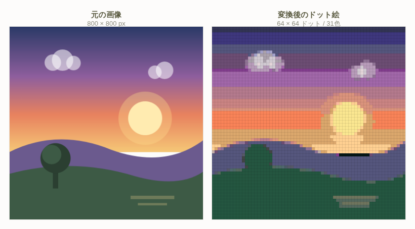
Pixelation is a majority vote, not a resize
What happens during conversion is not the same as shrinking a photo on screen. An on-screen resize keeps thin lines as faint traces. In pixelation, something closer to a majority vote happens: within one square, the color covering the most area wins and the rest disappear. Thin lines cover very little area, so they almost always lose.
Memorize one practical rule of thumb: does the element measure at least 1/32 of the image's width? When converting to a 64-dot canvas, 1/32 corresponds to two dots in the output. Two dots is enough to leave a recognizable line. Below one dot, it gets swallowed by its surroundings. On an 800-pixel-wide photo, anything thinner than 25 pixels won't survive — and once you internalize that, judging an image becomes very fast.
The rule applies to every "thin but meaningful" element: a lock of hair, eyeglass frames, a logo on a T-shirt, fence railings, tree branches, eyelashes. If you need one of those to survive, no conversion setting will save it. You either crop in closer until it is two dots thick, or you redraw it thicker in the source.
A quick test: before uploading, shrink the image right down in your phone's photo app. If you can still tell what it is at roughly thumbnail size, it will still read after conversion. Anything you can't identify at that size won't be identifiable as pixel art either. It's a crude test, but it predicts the outcome remarkably well.
2. What settings can fix, and what only the source image can fix
Sorting out what the settings can and can't do saves a lot of pointless trial and error. Heartopia Design Studio offers three conversion methods (Method 1 = Standard, Method 2 = Illustration / Simple, Method 3 = High Contrast), four levels of noise reduction (off / low / medium / high), plus a two-step color reduction and a custom manual reduction. All of these are powerful, but each one targets a very specific kind of problem.
| Symptom | Fixable in settings? | Where the fix belongs |
|---|---|---|
| Everything is dark and muddy | Partly | Method 3 or Method 2 lifts it, but areas crushed to pure black never come back |
| Colors look grainy and scattered | Yes | Noise reduction at medium or high, then color reduction |
| Too many colors to place by hand | Yes | The two-step color reduction plus custom reduction |
| The subject is too small to identify | No | Crop in closer — a source-image job |
| A busy background swallows the subject | Almost never | Background removal, or reshoot against a plain background |
| Blown-out white faces or clouds | No | There is no tonal data left in blown-out areas. Reshooting is fastest |
| Camera shake or out-of-focus blur | No | The edges simply don't exist. Use a different photo |
| Gradients turn into visible bands | Can be softened | Merge similar colors during reduction, though banding is inherent to pixel art |
Everything in the lower half of that table — the "no" rows — can only be dealt with before uploading. And those four (small subject, busy background, blown highlights, blur) account for a large share of real-world failures. When a conversion isn't working, switching methods three times is far slower than picking a different source image or re-cropping once.
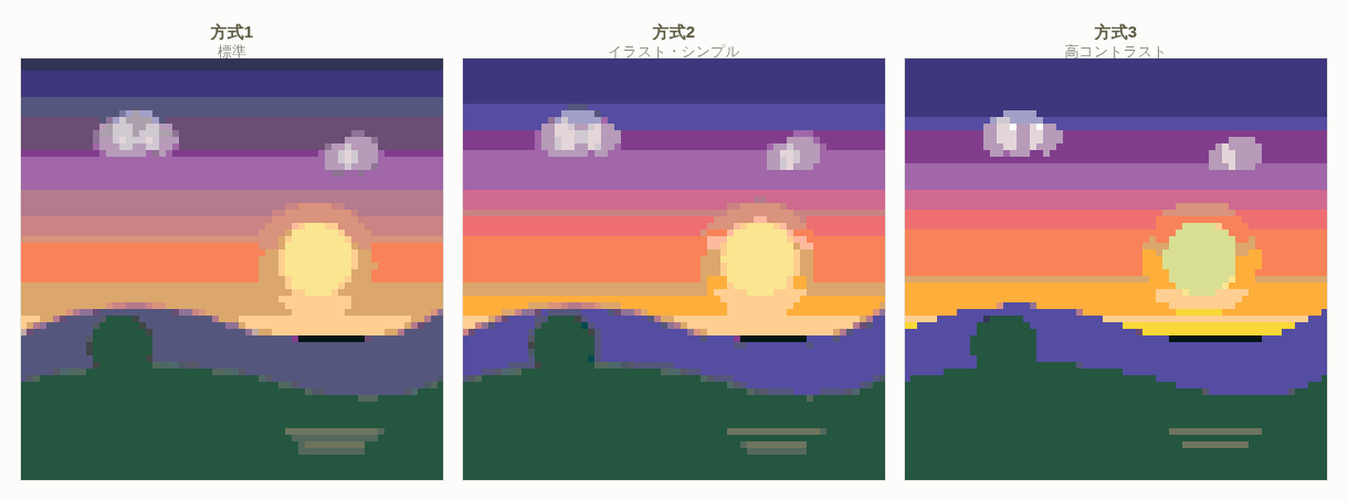
These three panels illustrate that conversion methods are seasoning, not reconstruction. Information absent from the source never appears in any of them. The flip side is encouraging: get the source right, and every method gives you something usable. In practice, the longer someone agonizes over which method to choose, the more likely it is that they should go back a step and fix the source instead.
3. A checklist for images that work and images that don't
When you have several candidate images, which do you pick? These seven checks will tell you before conversion whether an image is likely to work. You don't need every box ticked, but an image with three or more crosses will rarely satisfy you.
| Check | ◯ Works well | × Doesn't work | How to judge |
|---|---|---|---|
| Size of the subject | Fills 60% or more of the frame | A wide shot with a small subject | If a face matters, aim for at least 20 dots of face height |
| Background complexity | Flat color, sky, a wall, an even blurred surface | Shelves indoors, streetscapes, crowds, grass | Three or more distinct color masses behind the subject means trouble |
| Contrast | Subject and background clearly differ in brightness | White clothing against a white wall | Convert to grayscale and see if the boundary is still visible |
| Number of colors | The main colors reduce to three to six | Everything is colorful and no color dominates | Can you answer "what color is this picture?" in one word? |
| Direction of light | Front light, or light from an angle in front | Backlight (a window or the sun behind the subject) | Avoid it if the subject's near side is in shadow |
| Focus and blur | Crisp edges | Camera shake, subject motion, missed focus | At 100% zoom, check whether edges are doubled |
| How shadows fall | Soft shadows whose shape reads clearly | A hard shadow across a face, dappled light through leaves | Check whether shadow cuts the subject's shape into pieces |
The three that matter most
Of those seven, the three with the largest effect on the outcome are subject size, background complexity, and contrast. With those three in place, you can recover from a slightly busy palette or slightly harsh shadows using color reduction and noise reduction. Without them, nothing else you get right will make the result readable as pixel art.
Contrast is hard to judge by eye at first, so use a mechanical method. Drop the saturation to zero in your phone's editor so the image is black and white, then check whether you can still make out the subject's outline. Any pairing that vanishes in black and white will also melt together as pixel art. The tree trunk that got absorbed into the hill in the first figure is exactly this: the dark green of the trunk and the dark green of the hill were too close in brightness.
"How shadows fall" is the one people overlook most. Dappled light through leaves is a particular trap: it paints a mottled pattern of light and dark across the subject. Your eyes read that as sunlight through trees, but the conversion reads it as the subject's own markings. The result is pixel art with random speckles across a face or a shirt. With mottled shadows, choosing a different photo is faster than any amount of preparation.
4. Problems that show up constantly in phone photos
Most images people bring in are photos taken on a phone. Phone cameras are excellent, but several of their behaviors work against pixel art conversion. Here are the four most common patterns, split into symptom and remedy.
Symptom 1: Shot indoors in low light — everything sinks and the color dies
A photo taken at night or under weak lighting can look fine on screen while having very little tonal detail in the shadows and muddy color throughout. Convert it and the dark areas collapse into a single black mass with no readable shape. Remedy: reshooting is best — take the same subject by a window in daylight, or under bright lighting, and the result changes completely. If you can't reshoot, raise brightness and, at the same time, lift the "shadows" slider. Raising brightness alone washes the whole image out, so aim for roughly +10 brightness and +20 shadows, lifting only the dark areas. Pairing that with Method 2 (Illustration / Simple) at conversion time works well.
Symptom 2: Blown highlights — part of the sky or face is pure white
Over-bright areas contain no tonal data at all. White is white; darkening it later just gives you gray, not the pattern or shape that was there. The broken strip along the horizon in the first figure is the same phenomenon: a thin region whose brightness was wildly different from everything around it. Remedy: the only real fix is at capture time — lower the exposure slightly (on most phones, tap the screen and drag the brightness slider down). For a photo you already have, if the blown area isn't the subject, crop it out of frame entirely. If the face or the main subject is blown out, using a different photo is the quicker path.
Symptom 3: The face is too small — a wide shot
In a full-body shot, or a landscape with a person in it, the face occupies a few percent of the frame. On a 64-dot canvas that becomes a face 5 to 8 dots tall, with one dot each for the eyes and nose — in other words, only evidence that a face was there. Remedy: use the crop screen at upload time to adjust position and zoom until you're on the face. As a target, at least 20 dots of face height is enough for eyes, nose and mouth to exist as separate dots. If you want the full body in frame, give up on the face from the start and design around clothing color and silhouette instead; that produces much better results. "Full body and a readable face" is not achievable at this resolution.
Symptom 4: A cluttered background
Photos taken at home almost always include furniture, curtains, cables and laundry. People filter that out as "background" automatically. The conversion does not. Background detail gets pixelated with exactly the same weight as the subject, and it eats up slots in your very limited palette. Remedy: first, crop to reduce the proportion of background. Second, use the background removal feature. If you can reshoot, simply standing the subject in front of a white wall, a closed curtain or a plain cloth transforms the outcome. Hanging up a single plain sheet is the highest-value preparation there is.
If you can reshoot: there is a clear recipe for photos intended to become pixel art. Daylight by a window with the light in front; a plain background; the subject filling the frame; no flash. A photo that follows those four rules usually converts well with essentially no preparation at all.
5. Five prep steps that actually help before uploading
Now for what you actually do to the image in hand. Everything here is possible with your phone's built-in photo editor or any free editing app. Nothing elaborate is needed. In fact not overdoing it is the key point — for every one of these, "just a little" is the correct amount.
- Crop to make the subject bigger. This is the single highest-impact step. Crop in until the subject occupies 60% or more of the frame. Cut to roughly the same aspect ratio as your canvas (square for a square canvas), so that the crop screen at upload time only needs a small adjustment. Fitting a wide photo into a square canvas can cut off parts you didn't intend, so cropping it square yourself first is the safe approach.
- Raise brightness and contrast a little. Around +5 to +10 brightness and +10 to +15 contrast. More contrast widens the gap between light and dark areas, which helps colors separate during conversion. Push past +30, though, and the shadows crush to black and the highlights clip to white — information gone. Stop just before the point where it starts to look slightly too strong.
- Raise saturation a little. Around +10 to +20. Pixel art always comes out less vivid than the original, because the limited number of palette slots pulls colors toward neutral middle values. Nudging saturation up in the source lands you at about the right vibrance after conversion. Again, don't overdo it: past +40 skin turns red and greens turn fluorescent.
- Make the background flat, don't blur it. This distinction matters. Blurring the background with your phone's portrait mode still leaves a wash of many faint colors back there. The conversion picks up those faint differences too, and the blurred area becomes mottled dots. What you want is to fill the background with a single flat color. If filling it is impractical, use the tool's background removal, or simply crop until the background is out of frame.
- Erase what you don't need. Power lines, signage, passers-by, clutter on a desk — remove anything that isn't the subject while you're still in the source image. If erasing cleanly is hard, painting over it with a nearby color is entirely sufficient. Fine detail collapses during conversion anyway, so a slightly sloppy fill won't show in the result. Think of it as settling in advance every square that would otherwise make you hesitate later.
Order matters: crop → brightness and contrast → saturation → background → erasing. Crop first because you want to judge overall brightness on the framing you're actually keeping. Adjust brightness before cropping and the impression changes once you crop, sending you back to redo it.
Things not worth doing
Some preparation is simply wasted effort. These come up often enough to be worth naming.
- Upscaling the resolution. Conversion shrinks the image drastically, so around 800 pixels is plenty. Going to 4K changes nothing.
- Applying your own pixelation filter. The image gets pixelated twice and the edges break down further. Leave the conversion to the tool.
- Heavy sharpening. It creates white fringes along edges, and those fringes get picked up as their own palette color. It's a pure noise source.
- Pre-applying noise reduction. The tool has its own noise reduction setting; doing it twice strips out too much detail.
6. Preparing an illustration for conversion
Converting a drawing you made yourself is a different situation from converting a photo. Illustrations already have few colors and flat fills, which makes them far better suited to conversion than photos. Even so, a little work aimed specifically at conversion — rather than uploading it "as drawn" — changes the result substantially. There are three points.
1. Thicken your lines
The first thing to disappear from an illustration is the linework. Recall the "at least 1/32 of the width" rule from section 1. On an illustration drawn 1,000 pixels wide, lines need to be 30 pixels or more to survive reliably. Typical illustration linework is 3 to 8 pixels, so as drawn it either vanishes or breaks into fragments.
You can duplicate and stack the line layer, use a line-thickening function, or make the line color much darker than its surroundings so that even a thin line is more likely to be picked up as a color. In practice, though, making a drawing that doesn't depend on lines often works better than thickening them. If the shapes read from the fill colors alone, the picture still holds together when the lines go.
2. Reduce the number of shading steps in advance
Soft shading made with blurs turns into banding after conversion — the same phenomenon as the sky gradient in the first figure. With an illustration you can solve this on the drawing side before it ever happens. Flatten your shading into roughly three steps: base color, shadow, highlight, then convert. In other words, deliberately redraw the smoothly graded areas as flat, stepped fills.
Reducing the steps also tidies up the palette that comes out of conversion. A comfortable working range is 15 to 25 colors, and if you plan the illustration itself as "three for skin, three for hair, three for clothing, two for background," it will convert to roughly that count. The reasoning behind those steps is covered in detail in the pixel art color palette guide.
3. Make the background transparent or a single flat color
Unlike a photo, an illustration's background is entirely up to you. If you want the subject to stand out, a single flat color is the most reliable choice. Pick a color that is far from the subject in both hue and brightness — if the character's clothes are deep blue, use a pale cream background, giving yourself 30% or more difference in brightness.
Exporting as a PNG with a transparent background is another option. When you want only the subject placed within an in-game design frame, transparency is sometimes easier to work with. Which to choose depends on which design frame the finished piece is destined for.
On fine patterns: plaid on clothing, lace, small text and the like convert far more successfully if you prepare a simplified alternate version at the illustration stage. For plaid, make the lines three times thicker and the spacing three times wider. For text, a few characters in a heavy sans-serif. Building a dedicated source that prioritizes "readable as pixel art" over "faithful to the original" is how experienced users work.
7. How changing the crop changes the whole result
Among all the preparation steps, cropping is in a class of its own. From one single photo, where and how you cut produces completely different pieces of art. Take a photo of a person standing, and compare three ways of cropping it. Assume a 64×64 dot canvas.
| Crop | Face height in dots | What survives | What is lost | Best used for |
|---|---|---|---|---|
| Full body in frame | 5–8 dots | Overall silhouette, distribution of clothing color, the pose | Facial expression, patterns on clothing, the shape of the hands | Designs viewed from a distance; silhouette-driven pieces |
| Upper body (chest up) | 15–20 dots | Hairstyle, the broad shape of a collar or pattern, the outline of the face | Subtle expression, details of accessories | The best-balanced option. Choose this when unsure |
| Close-up on the face | 40+ dots | Eyes, nose and mouth, locks of hair, expression | The body, the background, any sense of context | Icon-like uses; when the expression is the point |
The important thing isn't which one is correct — it's that these are three different pieces of art with three different goals. Wanting the full body in frame and a readable expression is simply not possible at 64×64. Deciding "what is this piece showing?" at the cropping stage is what gets you to a result you're happy with in the shortest time.
Three judgements to make while cropping
- Put the center of the subject at the center of the canvas. In-game design frames show only a limited area, so a subject pushed to one edge can look cut off in use. Leaving a little margin on all four sides and centering the subject is the safe approach.
- Think about where you cut the body. On a person, cutting mid-neck, mid-wrist or mid-knee looks wrong. Cutting at natural divisions — around the chest, around the waist — sits much better. This is basic photographic composition, but with so little information in pixel art the awkwardness stands out more.
- Crop in the direction that reduces background. When torn between two crops, take the one with less background. Fewer palette slots spent on background means more colors available for the subject. Within a 15-to-25-color budget, the difference between five background colors and two is enormous.
In Heartopia Design Studio, uploading brings up a crop screen where you adjust position and zoom. Rather than trying to nail it in one go, convert a few times with different crops and compare the previews. You can redo the conversion as many times as you like, and uploaded source images are, as a rule, not stored — they are discarded after conversion. Experiment freely.
About free canvas mode: there is also a mode where you specify an arbitrary canvas size. If you want to make a wide landscape, or a long narrow banner-shaped design, choosing a canvas at the intended proportions from the start gives a far more natural composition than forcing the image into a square. Crop the source image to that same aspect ratio.
8. Are you allowed to use that image? Rights and a final check
After all the technical material, the most important check of all remains. Is this an image you are allowed to use?
Please note: photos taken by other people, illustrations drawn by other people, characters from anime and games, corporate logos and marks — every one of these has a rights holder. Don't upload them without the rights holder's permission, turn them into works, and publish or share the result.
Submissions to the "Everyone's Gallery" in Heartopia Design Studio are published after an administrator review, and works that use images, logos or characters owned by someone else without permission cannot be published. Searching for an image online, saving it and using it is especially risky in this respect.
Images you can use with confidence
- Photos you took yourself — pets, food, landscapes, your own belongings, yourself. The safest option by far.
- Drawings you made yourself — a phone snapshot of something drawn on paper works just as well as a digital piece.
- Photos of family and friends — even when you were the photographer, show the person and get their agreement first. Where someone's face appears, there is a question of how they feel about it, quite apart from rights.
- Stock material with stated terms — if you use assets from a distribution site, always read that asset's terms. Even "modification allowed" and "commercial use allowed" often come with separate rules about redistribution and public posting.
Even in a photo you took yourself, watch out for what got captured incidentally. If a stranger's face, a license plate, a nameplate or a shop sign appears in the background, erase it during preparation as part of the "erase what you don't need" step described earlier. Don't assume it will become illegible once it's pixel art — on a higher-precision canvas it can still be readable.
Final checklist before uploading
Here is everything above condensed into a form you can run through immediately before pressing convert. Once you're used to it, it takes about ten seconds.
| Check | Standard |
|---|---|
| Allowed to use it | You took it, you drew it, or you have checked the terms |
| Subject size | 60% or more of the frame. At least 20 dots of face height if the face matters |
| Background | Flat or simple enough. If cluttered: crop, erase, or use background removal |
| Light and dark | The subject's outline is still visible in black and white |
| Blown / crushed areas | No pure white or pure black patches within the subject |
| Focus | No doubled edges when viewed at 100% |
| Details you want to keep | At least 1/32 of the image width in thickness |
| Strength of edits | Within +5–10 brightness, +10–15 contrast, +10–20 saturation |
| Incidental capture | No strangers' faces, plates, nameplates or signs in frame |
In summary
Conversion settings are seasoning. Seasoning matters, but there's a limit to what it can do with poor ingredients. In pixel art conversion, the ingredients are three properties of the source image: size, tonal separation, and simplicity. The five minutes you spend getting those three right will change the outcome far more than thirty minutes of adjusting settings afterward.
And a good source image doesn't just look better — it becomes an easier blueprint to place by hand. A simple background means fewer colors; fewer colors mean fewer palette switches while placing squares; and when you work gradually in block mode, the picture starts to read as a picture much earlier. Quality of result and ease of building are both decided back at the source image.
Next time you set out to make something, start from "which image should I use?" and run through this article's checklist there. That alone will noticeably shorten the time you spend puzzling over the conversion screen.