Drawing Materials in Pixel Art — Cloth, Metal, Wood and Glass
You draw a shirt and it comes out looking like a plastic panel. You draw a sword and it reads less like steel than like a piece of grey paper. A wooden desk ends up as nothing more than a brown rectangle. This is the wall people hit once they can already draw pixel art reasonably well: the material doesn't come across. The shape is right, the color isn't wrong, and yet nobody looking at it thinks "that's fabric" or "that's iron."
The cause is almost always how you placed light and dark. Texture is not determined by the name of a color; it is determined by the pattern in which bright and dark areas are arranged. This article starts from that principle, then goes material by material — cloth, metal, wood, glass, stone and skin — giving concrete numbers for how to place values so that each one reads correctly. At the end we cover what to do when texture disappears from a pixel art piece that was converted automatically from a photo, and exactly where to intervene to bring it back.
1. Texture is not color — it is a pattern of light and dark
Let's establish the foundation that the rest of this article rests on. What determines how a material looks is not the color itself, but the way brightness changes across it. This is faster to grasp through an experiment than through explanation, so let's run a simple thought experiment.
The same grey can read as cloth or as metal
Imagine filling a 16×16 grid using nothing but four identical greys. In terms of value they are 85%, 65%, 45% and 25%. Zero hue, zero saturation — completely neutral.
Arrange those four from light to dark gradually, softening every boundary, and let the edges of each region wander irregularly, and the result reads as cloth. Take exactly the same four colors, lay them out as vertical bands instead, and let 85% sit directly against 25% with nothing in between, and the very same four colors read as metal.
Not one color changed. The only thing that changed is which value sits where, in what order, and in what shape. In other words, texture is not a palette problem — it is a placement problem. Most people stuck on "I can't find a color that looks metallic" are actually stuck on placement, not color.
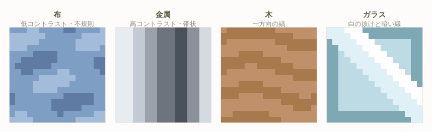
The three variables that define a texture
Value distribution becomes much easier to handle once you break it into three variables. When you are making a material read, these three are in fact the only things you are ever adjusting.
- Contrast range — the value gap between the lightest and darkest part of the material. Metal is 70% or more, cloth around 30%, skin under 20%. Each material has a roughly fixed range.
- Abruptness of change — how far the value jumps between adjacent pixels. It comes down to whether you insert an intermediate step between two tones. Metal skips the intermediate entirely; cloth always includes one.
- Regularity of the arrangement — whether the boundaries between light and dark are straight, irregular, or aligned in one direction. Wood is directional, cloth is irregular, metal is straight, stone is random.
| Material | Contrast range | Step-to-step value gap | Nature of boundaries | Direction |
|---|---|---|---|---|
| Cloth | 25–35% | 10–15% | Soft, gradual | Irregular, follows folds |
| Metal | 70–85% | 40% or more | Crisp, straight | Bands perpendicular to the light |
| Wood | 20–30% | 8–12% | Thin lines | Single grain direction |
| Glass / water | 60–80% | 30% or more | Crisp, diagonal | Diagonal streaks plus a dark rim |
| Stone / brick | 35–50% | 15–20% | Grainy, random | No direction, plus mortar lines |
| Skin | 15–25% | 8–12% | Very smooth | Follows the curvature |
This table is not something to memorize — use it as a reference to fall back on when you are stuck. If something feels "metallic when it should be cloth," the value gap between adjacent steps is usually above 20%. Conversely, if metal is coming out looking like cloth, either the gap is too small or you have inserted too many intermediate tones at the boundaries.
Tip: When a material isn't reading, count "what is the value gap between my lightest pixel and my darkest pixel?" before you change any colors. Metal that only spans 40%, cloth that spans 60% — the cause usually becomes obvious as a number.
2. Material by material — six basic patterns
From here on we go material by material with concrete steps and pointers. Each card is organized around the same three points — contrast, how to handle boundaries, and where to place things — so feel free to read only the card for the material you are working on.
Cloth — low contrast, irregular, soft shading that follows the folds
Cloth scatters the light it reflects. Its surface is covered in fine fibrous irregularities, so light does not bounce back in a single direction and the surface looks roughly equally bright from any viewing angle. That fact translates directly into how you draw it.
- Keep total contrast to about 30%. If the base is 60% value, the shadow is 45%, the deep shadow 35%, and the highlight around 72%. Push the shadow down to 20% and it stops looking like cloth and starts looking like leather or rubber.
- Always insert at least one intermediate pixel between steps. Going from 60% to 45%, place one or two columns of roughly 52% at the boundary. That intermediate tone is what creates the impression of softness.
- Never let the edge of a shadow be a straight line. Break it up and down in units of one to three pixels. A straight shadow edge signals a rigid board, so on cloth you must always disrupt it.
- Draw folds as bands, not as lines. A one-pixel line of shadow reads as a seam. Make fold shadows two to four pixels wide, and brighten just one side of that band to turn it into a convincing crease.
- Radiate folds from the point where the fabric is being pulled. From the shoulder toward the chest, from the waist toward the hem, and so on. Wrinkles always have an origin. Wrinkles scattered without an origin read as crumpled paper.
Thick wool and felt need contrast suppressed even further, down to around 20–25%. Satin and silk are the exception — they do produce a genuinely bright area for a fabric — but that highlight should be a loose band three to six pixels wide, never a sharp metallic line.
Metal — high contrast, banded, with abrupt switches between light and dark
Metal does not scatter light; it reflects it in one direction like a mirror. The result is the distinctive look of "very bright" sitting directly against "very dark" with nothing in between. That abrupt switch is what metal actually is, visually.
- Make the value gap between adjacent steps 40% or more. Place a 40% pixel directly beside an 85% one. Carefully inserting intermediate tones here is exactly what kills the metallic quality and turns it into plastic.
- Secure a total contrast range of 70–85%. Aim for a state where the same sword blade contains both pixels above 90% value and pixels below 15%.
- Arrange light and dark in bands. On a cylindrical piece of metal — a blade, a pipe, an armored arm — run bands perpendicular to the light source: bright, dark, mid-bright, dark. Bands are one to three pixels wide, and it looks more convincing if the widths are not uniform.
- Add another bright band below the dark one. Metal picks up light from its surroundings, so the area just outside the darkest region becomes bright again. This dark-to-bright reversal is what produces the characteristic glint. Skip it and you are left with a dull grey lump.
- Draw the environment reflecting in it. Placing a few pixels in the lower half that mix in the color of the floor or ground — a brown or a green — instantly reads as a reflection. The trick is to never paint metal entirely in neutral greys.
It also helps to know the adjustments per type of metal. Gold shifts its light end toward yellow and its dark end toward red-brown. Copper and brass shift further toward red. Iron and steel shift the light end slightly blue and the dark end toward blue-violet. Rusted metal keeps the metallic contrast pattern intact but replaces only the mid-value band with red-brown, which expresses the mix of areas that have lost their shine and areas that still have it.
Wood — unidirectional streaks, knots, and low-saturation browns with modest value gaps
The single most important thing about wood is that the variation in light and dark all runs in one direction. Its contrast is as low as cloth, and it still reads as wood purely because of that directionality.
- Draw the grain as one-pixel lines, four to twelve pixels long, broken up. Running lines all the way from edge to edge produces striped fabric instead. Vary the lengths, and thicken or thin a line by a pixel partway along to make it natural.
- Keep the grain only 8–12% away from the base value. At 20% or more it stops looking like grain and starts looking like a gap or a groove between planks. Grain is supposed to be barely visible.
- Never make grain lines perfectly parallel. Let them undulate by one or two pixels, and have two lines merge or split apart here and there.
- Include one or two knots. Make a point where the grain lines converge into a swirl, and place two to four pixels about 20% darker than the base at its center. A single knot makes the piece read as wood even when there is very little grain elsewhere. On a small canvas, limit yourself to one knot.
- Keep saturation at 30–50%. Push wood browns too vivid and you get orange plastic instead of wood. Lowering saturation on the lighter tones in particular gives you the quality of dry timber.
- Make plank seams darker than the grain. On a plank floor or wall, run a line 25–35% darker than the base between adjacent boards. Unlike grain, this one line may run perfectly straight.
For weathered or antique wood, drop saturation another 10% or so and push the light end toward grey. For varnished furniture with a glossy surface, keep the grain pattern as it is and lay one wide bright band — five pixels or more — across the whole surface to produce the sheen.
Glass and water — transmission, strong white highlights, dark rims, refractive offsets
Glass and water differ fundamentally from every other material in that they have almost no color of their own. What you see is the background behind them, plus reflections, plus what refraction does at the edges. Drawing glass therefore means drawing not the glass, but the background seen through it.
- Fill most of the surface with the background color. The interior of glass should either use the background color directly, or that color shifted by only 5–10% in value. Flat-filling it with your own shade of light blue produces a light blue plastic panel, not glass.
- Darken the rim. Light refracts and effectively concentrates at the edges, so the inner one or two pixels of the outline are always darker. Make this dark rim 20–30% darker than the background. Half of what makes glass read is decided right here.
- Highlights are white dots or thin diagonal lines. Place only two to five near-pure-white pixels at 95% value or above, arranged diagonally. Do not add more. Glass highlights follow the principle of "few and strong."
- Offset the background to show refraction. If a line passes behind the glass — a table edge, a floor seam, a character's outline — shift that line sideways by one to three pixels inside the glass. A single offset like this is enough to communicate a transparent solid.
- Water surfaces are horizontal bands. Water ripples horizontally, so arrange light and dark in thin horizontal bands. Scatter short one-pixel-tall horizontal highlights with gaps between them.
- Underwater areas gain saturation and lose value. Anything submerged should mix in 10–20% of the water color, a blue-green, and drop further in value the deeper it goes.
Ice needs higher contrast than water, plus a few straight white streaks inside for cracks. Colored glass — stained glass or a bottle — should be filled with the background color mixed 50–70% toward that hue, while the rules for white highlights and dark rims apply unchanged.
Stone and brick — irregular grain and dark mortar lines
Stone sits at a contrast level between cloth and metal, and its defining feature is having no directionality at all. The goal is to create something that is "random and yet evenly distributed."
- Scatter grains 15–20% above and below the base value. Use clusters of one to three pixels covering roughly 20–30% of the area. Single isolated pixels sprinkled densely just look like noise, so mixing in two- and three-pixel clusters is essential.
- Do not space the grains evenly. The human eye immediately recognizes even spacing as a pattern. Deliberately bunch some grains together and leave other areas empty, creating dense and sparse regions.
- Mortar lines are one pixel wide and 30–40% darker than the base. On stone walls and brickwork this line carries more information than anything else. Draw the mortar properly and the surface reads as stone even with very little grain.
- Place bright pixels above the mortar line. The top face of a stone catches the light, so a row of pixels 15% brighter than the base, sitting one pixel above the dark mortar line, gives the stack of stones real thickness.
- Brick is regular, natural stone is not. Bricks are identical rectangles offset by half a length each row. Natural stone varies in both size and shape, with pentagons and hexagons mixed in.
- Keep saturation low, at 10–25%. Stone is close to grey, but do not use pure neutrals — nudge it slightly warm or slightly cool so the image doesn't go dead.
Skin — extremely low contrast, with hue shifts carrying the color of blood
Skin is one of the hardest materials in pixel art, because you can barely express it through value differences at all. Most of the information in skin lives in subtle shifts of hue.
- Keep the contrast range to 15–25%. If the base is 75% value, the shadow is around 62% and the highlight around 85%. Widen it and you get clay or ceramic instead of skin.
- Shift shadows toward red or red-violet. Skin shadows carry a reddish cast because blood beneath the surface shows through — they are not grey. Along with dropping value by 12%, shift hue 10–20 degrees toward red and raise saturation by 5–10%.
- Add flush to cheeks, nose tip, fingertips, ears, elbows and knees. Place a few pixels that keep the same value as the base but raise saturation by 10–15%. Not changing the value is the key — that is what makes the eye read it as blood color rather than as a bump.
- Highlights are areas, and they are small. Two to six pixels about 10% brighter than the base on the nose tip, cheekbones and forehead. Make them sharp points like metal and they read as sweat or oil instead of skin.
- Do not outline skin in black. Outline it with the shadow color pushed another 15% darker toward red-brown. A black outline destroys the softness of skin instantly.
On a small canvas you will usually have only two or three colors available for skin. In that case, drop the highlight and use only the base plus a red-shifted shadow. For skin, the hue of the shadow matters far more than the highlight does.
Caution: All of these per-material rules assume you are drawing that material at a reasonable size. If your canvas is small and the material occupies an area of ten pixels square or less, drawing wood grain or stone grain will just look like dirt or noise. When the area is small, drop the texture detail entirely and match only the contrast range to the material. That alone communicates it perfectly well.
3. The shape of the highlight decides the material
If you take away only one thing from this article, make it this chapter. When a viewer judges what material something is, the single strongest cue they reference unconsciously is the shape of the highlight. Whatever you do with the base color, the material will read if the highlight shape is right; and if the highlight shape is wrong, it will not read no matter how carefully you render everything else.
| Material | Highlight shape | Area | Value | Boundary handling |
|---|---|---|---|---|
| Metal | Sharp line, 1–2 px wide | 3–5% of the piece | 90–100% | Straight to base, no intermediate |
| Cloth | An area, 4+ px cluster | 10–15% | Base +12% | 1–2 intermediate pixels |
| Glass / water | White dot or thin diagonal | 2–4% | 95–100% | Direct, surroundings darker |
| Wood | Wide, loose band | 8–12% | Base +10% | Runs across the grain lines |
| Stone | A cluster of grains, not an area | 5–10% | Base +15% | Each grain independent |
| Skin | Small area | 5–8% | Base +10% | Intermediate pixels for smoothness |
Why shape decides it
A highlight is the image of the light source reflected on the surface of the object. The smoother and harder the surface, the more that image shrinks and sharpens; the rougher and softer the surface, the more it spreads and blurs. Metal's sharp line is the state where the image of the light source is reflected almost intact; cloth's broad area is the state where that image has been scattered across the fibers. Once you know this physical reason, you can decide highlight shapes yourself for materials not in the table — leather, ceramic, fur, jelly — simply by asking "how smooth is this surface?"
An experiment that makes it obvious
Place three identical spheres side by side, keep the base color and the shadow exactly the same on all three, and change only the highlight.
[The same sphere with only the highlight changed]

 A: reads as cloth     B: reads as metal    C: reads as glass
 ..######..           ..######..           ..######..
 .###@@@##.           .####@###.           .###@#####.
 ####@@@###           .###@#####           ####@######
 ####@@####           ####@#####           #####@#####
 ##########           #####@####           ###########
 .########.           .########.           .###..####.
 ..######..           ..######..           ..######..

 @ = highlight
 A: placed as a mass (roughly a 3x3 area)
 B: placed as a diagonal 1-pixel line
 C: placed as dots, with the background showing
    through below (..)
The difference between A and B is not the number of pixels placed — it is only whether the arrangement is an area or a line. The impression each one gives is nonetheless clearly different. This experiment takes ten minutes, so it is well worth trying once before applying any of this to your own work.
Tip: A highlight goes not on the surface nearest the light, but where the surface faces most directly toward the light. On a sphere that is a point pulled slightly toward the light source; on a cylinder it is a vertical band on the lit side; on a flat plane the entire plane brightens slightly. A highlight in the wrong position breaks the sense of volume before it ever gets to texture.
4. Priorities for showing texture with very few colors
Once you factor in actually placing this tile by tile in Heartopia, you can afford at most two to four colors per material. Under that constraint, the result is decided less by "what to draw" than by what to give up. Here is the order in which you should spend colors on texture.
- Match the contrast range to the material (possible with two colors) — the top priority. For metal, push the light and dark far apart; for cloth, bring them close. This alone conveys half of what the material is.
- Decide how boundaries behave (possible with two colors) — whether the edge between light and dark is straight or irregular. It costs zero additional colors and has an enormous effect.
- Get the highlight shape right (your third color) — if you can spend a third color, spend it on the highlight without hesitation. As chapter 3 showed, the right shape works even at one or two pixels.
- Shift hues (costs no colors at all) — shadows toward red-violet, light toward yellow. The most efficient move available: information increases without the color count going up.
- Add bounced light and environment color (your fourth color) — the bright band low on metal, the background seen through glass. Reaching this point makes the material unmistakable.
- Patterns such as wood grain or stone speckle (fifth color and beyond) — last, and only when the area is large. Trying to do this first and running out of colors is the single most common mistake.
What to do when you only have two colors
When a material can be allocated just two colors, reason as follows.
- Metal — 85% value and 25% value. Create no intermediate; alternate these two in bands. Metal reads even at two colors.
- Cloth — 60% and 47%. Hold the gap to 13% and keep the boundary irregular.
- Wood — 55% and 45%. Use the darker one as the grain, broken up and running in one direction.
- Glass — the background color itself, plus pure white. Let the outline color double as the dark rim.
- Skin — a 75% base and a 63% red-shifted shadow. Do not make a highlight.
Caution: Reusing the same color across multiple materials is an effective way to save colors, but never share between materials with different contrast personalities. Reuse a metal's dark tone as a cloth shadow and the cloth's contrast leaps upward and it stops reading as cloth. Share only between materials with similar personalities, such as cloth and skin, or wood and stone.
5. Separating materials that sit next to each other
When several materials appear in one image, you can render each of them correctly on its own and still find that they become indistinguishable the moment they sit side by side — armor against clothing, a wooden grip against an iron blade. The cause is not that the individual materials are drawn badly, but that the relationship between them was never designed.
Put a one-pixel dark line at the boundary
Where two different materials meet, insert a one-pixel line at least 25% darker than both base colors. This is not the same thing as an outline; it is a divider indicating that the material changes here. With that line present, the viewer reads two separate objects even when the colors on either side are similar. Conversely, never insert this line where the same material continues — between a sleeve and a bodice, for instance.
Create a deliberate difference in contrast
If two adjacent materials have similar contrast ranges, the difference in texture cannot be read. Take a sword: the blade (metal, 80% range) against a leather grip (30% range). Separating the ranges themselves by a factor of two or more makes the materials distinguishable even when the colors are close. Render blade and grip at similar contrast and the whole thing looks like one carved object.
Base values may be close together
This may sound counterintuitive, but the base values of adjacent materials can be reasonably close. The difference between materials is communicated by the contrast range and the nature of the boundaries, not by the base color. Pushing base values too far apart actually makes the whole image feel disjointed. Keep base values aligned and separate materials by the swing of light and dark — that is the guiding principle when handling multiple materials.
6. Restoring texture lost during automatic conversion
When you convert a photo or an illustration in the Design Studio, you will sometimes find that the shapes came out cleanly but the material quality has gone flat. There are a handful of standard causes for this, and each has a standard fix.
Cause 1: noise reduction set too strong
Noise reduction exists to remove isolated pixels that are awkward to place and make the work easier, but wood grain, stone speckle and the weave of fabric are, mechanically speaking, almost the same thing as noise — scattered variation in light and dark at a scale of a few pixels. Set it to Strong and it removes detail you wanted to keep.
The fix is to convert first with noise reduction off or on Weak, and check how much texture survives. Then, if there are isolated pixels that are genuinely awkward to place, do not raise the noise reduction — fix those few pixels by hand with the pen or eraser in design edit mode. Raising the global setting costs you the whole image; fixing by hand costs you only that spot.
Cause 2: the conversion method doesn't suit the material
There are three conversion methods, and texture behaves differently under each.
| Method | Character | Materials it favors | Materials it hurts |
|---|---|---|---|
| Method 1 (standard, perceptual color difference) | Preserves the original color relationships faithfully | Skin, cloth, wood — anything where midtones matter | Metal in a dull photograph |
| Method 2 (illustration / simple) | Raises brightness and contrast | Anime-style clothing, flat-shaded illustration | Materials whose shadow detail matters |
| Method 3 (high contrast) | Emphasizes contrast and saturation | Metal, glass, water, gemstones | Skin, pale fabrics |
When metal or glass refuses to read, trying method 3 is the shortest route. As chapter 1 showed, the metallic quality arises from abrupt switches between light and dark, so a process that emphasizes contrast directly emphasizes that quality. Conversely, apply method 3 to an image where skin is the subject and the shading on the cheeks splits cleanly in two, producing something that reads as a mask rather than a face. Choose the method according to the material. When one image has several materials all playing a leading role, the realistic approach is to pick the method that suits the most important one and repair the rest by hand.
Cause 3: color reduction ate the steps that carried the texture
Color reduction runs in two steps: one that removes colors used in only a few places, and one that merges similar colors. The colors that create texture are usually small in area and very close to the base color, which means they are the first casualties of both steps. Wood grain lines and stone speckle are exactly this.
The fix is not to leave it entirely to the automatic reduction, but to pick colors yourself with custom manual color reduction. What is safe to remove: background midtones unrelated to texture, and awkward colors that appear one or two pixels at a time near outlines. What to keep: the colors deliberately scattered as grain or speckle. To tell them apart, use the per-color highlight display and look at where that color is distributed. Regularly aligned in one direction means wood grain; spread evenly across the whole area means stone speckle; scattered along outlines means it is safe to remove.
Cause 4: the texture was never in the source image
This one is surprisingly common. A photo taken head-on with a flash produces almost no shadow, so every material in it comes out flat. In that case no amount of tweaking the conversion settings will produce texture. The most reliable fix is simply to pick a different photo, one lit from an angle. If that isn't possible, you will be adding the light and dark by hand with the pen in design edit mode, following the rules in chapter 2.
Tip: When adding texture by hand, the 10×10 tile units of block work mode are useful. Wood grain and stone speckle need to be spread evenly across the whole piece, and filling in one block at a time keeps the distribution from clustering. Setting yourself a rule such as "three to five grains per block" makes the variation across the whole piece even out naturally.
7. Common failures and how to fix them
Failure 1: clothing looks like plastic
Cause: the value gap between base and shadow is too large (20% or more), or the boundary has no intermediate tone and runs straight.
Fix: bring the shadow back to a 10–15% gap and insert one column of intermediate tone at the boundary. Then break the shadow edge irregularly in units of one to three pixels. In most cases this needs no additional colors at all.
Failure 2: a sword or armor looks like grey paper
Cause: insufficient contrast. Usually the brightest area stops around 70% value and there is not a single pixel above 90%.
Fix: raise the brightest band to around 92% and place a band below 30% directly against it. Then add a bright bounced-light band just outside the darkest region. These three moves turn it into metal.
Failure 3: wood looks like nothing but a brown rectangle
Cause: there is no grain, or the grain consists of evenly spaced parallel lines running edge to edge.
Fix: break the grain up, vary the lengths, and add a single knot. If that isn't enough, run one dark plank seam through it. A seam carries more information than grain does, so on a small area the seam alone is sufficient.
Failure 4: glass looks like light blue plastic
Cause: the interior is flat-filled with your own shade of blue and the background does not show through.
Fix: replace the interior with the background color, darken the inner one or two pixels of the rim, and place just two or three white dots. Not painting a "glass color" inside the glass is the single most important point.
Failure 5: skin looks like clay, or like a zombie
Cause: grey or black mixed into the shadow, or a contrast range that is too wide.
Fix: raise the shadow's saturation and shift its hue 10–20 degrees toward red or red-violet. At the same time, narrow the gap from the base color to around 12%. Remember that skin shadow is not "darker" — it is "redder, and slightly darker."
Failure 6: adding texture made the whole piece look dirty
Cause: too much detail for the area, especially large numbers of single scattered pixels.
Fix: cut the detail in half. Halve the number of grain lines; for stone, drop the single-pixel speckles and keep only the two- and three-pixel clusters. Texture needs only the bare minimum required for it to be recognized — beyond that it is nothing but noise.
8. Summary
Making materials read is not a matter of talent or of observational skill — it is a combination of a few rules. Here is the article condensed into a form you can actually apply.
- Texture is decided by the distribution of light and dark, not by color. The same four colors can become cloth or metal depending on how you arrange them.
- There are only three variables to adjust — contrast range, abruptness of change, and regularity of the arrangement.
- Learn the contrast ranges — metal 70–85%, glass 60–80%, stone 35–50%, cloth 25–35%, wood 20–30%, skin 15–25%.
- The shape of the highlight decides the material — a sharp line for metal, an area for cloth, white dots for glass, a wide band for wood, grains for stone.
- With few colors, spend them on contrast and boundaries, not on patterns. Wood grain and speckle are the final luxury.
- Noise reduction removes texture too. Start at Weak or below and repair only the specific spots with the pen.
- Start from method 3 when metal or glass leads, and method 1 when skin or cloth leads.
Start by opening one piece you already have and counting, for each material in it, the value gap between the lightest and darkest pixel. Wherever that number departs from the ranges above is the first place to fix. Once checking with numbers becomes a habit, you can build texture deliberately instead of relying on instinct.